

11 Things Your Therapist Homepage Needs
Your homepage is the most visited page on your therapy website. The most common mistake I see therapists make is either putting too much information or not enough.
So let’s break it down to the essentials. Your homepage only needs to do three things:
Help your visitor feel seen
Help them understand who you help and where
Show them the next step to take
In this post I’ll cover the 11 essential elements that make this happen.
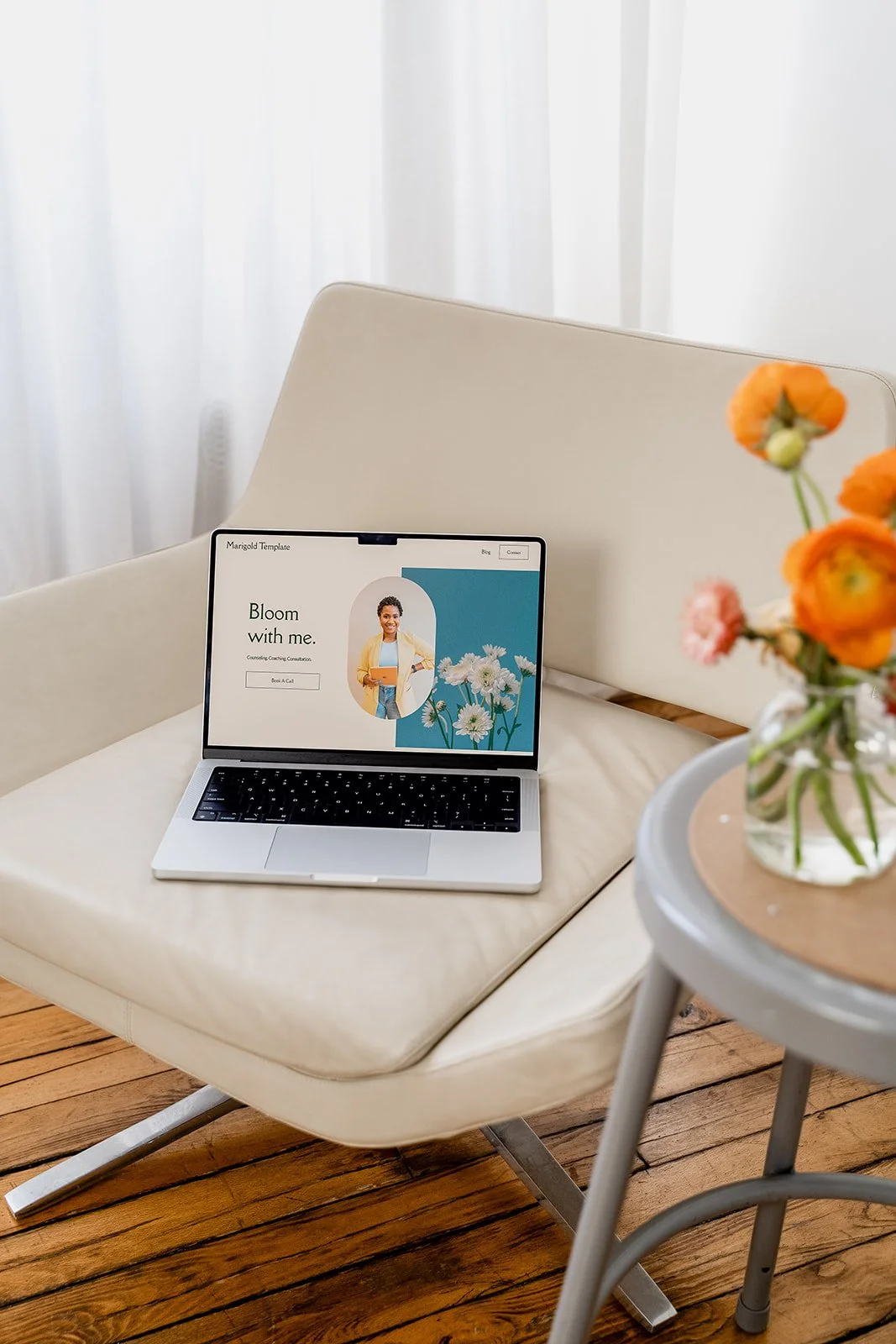
🌻 Looking for help with writing your website? Bloomy can help! Bloomy is my GPT writing assistant trained to help you write your content quickly and simply for $67!
Discover Bloomy->
1. A Clear Headline That Answers "Am I in the Right Place?"
Why this matters: You have just a few seconds to make an impression on your visitor before they click away. Your headline should immediately communicate three things: what you do, where you do it, and who you do it for.
Think about what I call the "3am Client Test" - imagine someone landing on your site at their most overwhelmed moment. Can they immediately tell from your headline that you serve their state, offer their preferred format (online or in-person), and work with people like them?
Location and format aren't just details - they're deal-breakers. Therapists can only serve clients in states where they're licensed, and someone looking for in-person therapy in their area needs to know if you're a reasonable commute away.
Instead of: "Supporting individuals through life's challenges"
Try:
"Online therapy for adults in California struggling with anxiety and burnout"
"In-person couples therapy in downtown Austin helping partners rebuild connection"
"Virtual EMDR therapy for trauma survivors across New York State"
"Therapy for teens in the Boston area navigating depression and school stress"
The more specific you can be about what you do, where you practice, and who you help, the faster the right people can find you - and the wrong-fit people can move on without wasting anyone's time.
2. An Empathic Welcome
Why this matters: People don't come to your website looking for your credentials or even your mission statement. They come because something in their life feels heavy. People decide within seconds whether they want to stay on a website. Resonating with your visitor emotionally first is what will get them to want to stay and explore.
Lead with empathy, not expertise. Meet them where they are emotionally, right now, before talking about where therapy could take them.
Example: "If you're here, you're probably carrying more than anyone realizes. You've been trying to keep it together for a long time and it's exhausting. I'm glad you found your way here."
Use your own voice. So if that’s real-talk and curse words, do that, it doesn’t have to sound like my example-it should sound like YOU.
3. A Specific "Who I Help" Section
Why this matters: Visitors are scanning to see if you're the right fit for them. They are reading about 10% of what you wrote. If they have to read five paragraphs to figure out whether you work with their specific situation, they might leave before finding that answer.
Also, being specific about who you work with builds trust faster and is more hepful than trying to appeal to everyone.
Use a short 1-2 sentence formula:
I help ______ who are struggling with ______ so they can ______.
Examples:
I help millennial women navigating anxiety, burnout, and people-pleasing
I help neurodivergent adults create calmer systems and routines
I help couples rebuild trust and communication after infidelity
Keep it concise. When you list every population you've ever worked with, it can actually make you look less specialized (like a menu where they offer sushi, pizza, and escargot).
4. How You Help at a Glance
Why this matters: This section gives visitors a sense of your approach without overwhelming them with details (you can dive into that one your Services page). It helps them understand what working with you might look like.
Keep it simple with:
2-3 bullet points about your general approach
A short paragraph that feels conversational
A visual "snapshot" section
Example: "I use a blend of talk therapy and practical tools to help you:
Understand what's driving the anxiety
Build real skills you can use when you're overwhelmed
Find more ease in your day-to-day life"
If you think your ideal clients are actively searching for specific modalities like "EMDR" or "IFS” then you shoud include those here as well (but just the relevant one, not every training you’ve ever attended).
5. Contact Information That's Easy to Find
Why this matters: Most website visitors view sites on mobile, often at night when they're feeling distressed. If they have to hunt for your phone number, you might lose the connection.
Make it visible:
Phone number (and check that it’s clickable on mobile)
Your city/location clearly stated
Email address or contact form so they can reach out
Office address (if you see clients in-person)
Where to put it:
You should have a designated contact page
You should also include with information in the footer (that’s the section at the bottom of a website that shows up on every page)
6. One Primary Call-to-Action
Why this matters: A “Call-to-Action” is the main next step you want them to take. When visitors see too many competing options ("Schedule now!" "Read my blog!" "Download my guide!"), it creates confusion.
Primary call-to-action examples:
"Schedule a free 15-minute consultation call"
"Request an appointment"
"Book your first session"
"Get in touch with me today"
Place your primary call-to-action in at least two spots: near the top (after your welcome) and at the bottom of the page. You can also include a clickable banner or button in your main navigation (as long as it doesn’t look too cluttered).
About secondary calls-to-action (for people who aren’t ready to connect with you yet): It's totally fine to have a secondary call-to-action (like "Download my free guide" or "Read more about me") for visitors who aren't ready to schedule yet. Just make sure it's clear which action is the main one (by repeating it consistently throughout the site).
💡Want more help writing effective calls to action? Check out this article Using Calls to Action to Make Your Website More Engaging
7. Strategic Use of Credentials
Why this matters: While leading with credentials is a mistake, leaving them out entirely can raise questions. Visitors need to know you're legitimate - especially for AI search tools that prioritize expertise and trustworthiness.
Where to include credentials:
A brief mention in your welcome or bio section: "I'm [Name], a licensed therapist in [state]..."
A credentials line near your photo: "[Name], LMFT, EMDR-trained"
Keep it to one line on the homepage - save the full details for your About page
This isn't about listing everything - it's about providing the reassurance visitors need to feel confident reaching out.
8. Images That Match Your Message
Why this matters: Visual processing happens faster than reading. The imagery you choose sets the tone before someone even reads your words.
Things to consider:
Avoid photos that feel cliché (random landscapes, stacks of rocks, overly posed people or people that are clearly professional models)
Imagery that feels quiet, grounded, and natural tends to work well
Including a professional photo of yourself helps visitors picture connecting with you
Different therapy approaches call for different visual tones. A trauma therapist might choose very different imagery than a career coach.
🔧 Technical note: Make sure the image files you're using aren't too big. Around 500KB is ideal. If you have a photographer, ask for "web-safe" images. If you're using a stock site like Unsplash, notice you usually have Small, Medium, and Large download options - choose Small or Medium for web use. Large files slow down your site, which creates frustration for visitors.
9. Scannable Formatting
Why this matters: When someone is feeling overwhelmed or in crisis, their ability to process dense information is limited. Making your homepage easy to scan isn't just good web design, it's a more accessible experience.
Make your homepage easy to scan with:
Short paragraphs (3-4 lines max)
Short sentence lengths
Text boxes that don’t span more than half a screen length
Lots of white space
Descriptive headings that act as signposts
Bullet points for lists
Consistent, predictable structure (it’s not boring, it’s grounding)
If someone can skim your page in 30 seconds and understand who you help, how you help, and what to do next, you've succeeded.
10. An FAQ Section
Why this matters: AI-powered search tools (Google's AI Overview, ChatGPT, Perplexity) are changing how people find therapists. FAQ sections help you show up in these AI results, and they answer the questions visitors might be nervous to ask directly.
Essential questions to answer on your homepage:
Do you accept insurance?
What are your fees?
Do you offer virtual sessions?
What's your cancellation policy?
How do I know if we're a good fit?
How to structure FAQ sections: Use clear question headers followed by direct, concise answers. Example:
Do you accept insurance?
"I'm an out-of-network provider. I can provide superbills for potential reimbursement from your insurance company."
Keep answers to 2-3 sentences each on your homepage. You can always link to a more detailed FAQ page for people who want more information.
💡You can find a deeper dive on FAQ pages (what to include and their benefits) here: FAQ Pages for Therapists: An Easy Win for SEO and Your Clients
11. Mobile Optimization
Why this matters: More than half of therapy website visitors access sites from their phones, often late at night when they're feeling most vulnerable. A homepage that is clunky on mobile doesn't serve the people trying to find you.
Check your mobile experience:
Does your site load in under 3 seconds?
Is your phone number clickable?
Can visitors easily tap buttons without accidentally clicking the wrong thing?
Are images sized appropriately (not too big, too small or causing the screen to scroll horizontally?)
Is text large enough to read without zooming?
Mobile formatting isn’t optional anymore . Google actually prioritizes mobile first and AI tools are following suit!
To Sum it Up
Your homepage doesn't need to be perfect — it needs to feel like a grounding presence.
If your page communicates: "You're in the right place, I see you, here's the next step," you're doing it right. These 11 elements work together to create that experience - not through flashy design or clever copy, but through clarity, empathy, and thoughtful structure.
Frequently Asked Therapist Homepage Questions
-
Aim for 400-800 words. Long enough to communicate the essentials, short enough to stay scannable. Save detailed information for dedicated pages.
-
Yes. A professional, friendly headshot builds trust and helps visitors visualize connecting with you. People want to see who they'll be talking to. -
Review it every 6-12 months to ensure language, services, and contact information are current. Update sooner if your ideal client or approach shifts. -
Leading with credentials instead of empathy, or trying to appeal to everyone instead of being specific about who they help best.
🌻 Meet Bloomy: Your Therapist Website Writing Companion
Want help writing your homepage without starting from scratch?
Bloomy helps you create content that feels true to you–no generic AI tone, no sales-y language.