Beautiful Therapist Websites to Inspire You Today


Post last updated April 2026
When you’re creating a website for your practice it helps to have both visual inspiration AND the language to describe what you want (whether you are DIYing your site or hiring a designer).
In almost every design consultation I do: a therapist shows me a website and says "I want something kinda like this –but I don't know how to explain why I like it." It’s something along the lines of “I’ll know it when I see it.”
And honestly? That’s not on you. Design has its own language, and you don’t learn it in grad school.
So this post does two things. First, it shows you real therapy websites that are not only beautiful, but strategic, cohesive, and right for the person behind them. Second, it gives you the words to describe what you're drawn to, so that you can communicate your vision either to your designer or as you are researching to DIY.
Warm & Natural Web Design
Grounded. Human. Alive.
The color palette tends to pull from earth–warm neutrals, soft greens, terracotta, muted clay. There are often nods to the natural world: botanical elements, organic shapes, textures that feel tactile rather than flat. Nothing is too polished or too perfect. That's intentional. This aesthetic says: I'm a real person, and so are you.
Taylor Young Therapy
See the live site

Taylor is a skilled therapist who works with young adults, parents, and early-career clinicians — and she was clear from the start about what she wanted: a site that would attract high-end clients while still feeling completely human. No corporate polish. No corny stock photos. Something that matched her: knowledgeable, direct, warm, and funny. Someone who loves to be in nature, is intentional about how she moves through the world, and is deeply invested in the real complexity of people's lives.
The design responds to all of that. Earth tones and botanical line drawings for warmth; clean navigation and modern scroll effects do the sophistication. The nature imagery isn't simply there to be pretty. It's a signal to a specific kind of client that this is a specific kind of therapist.
What makes it feel warm & natural:
Earth tone color palette
Botanical line drawings
Handwriting font as an accent
Nature and greenery imagery throughout
What keeps it feeling modern:
Interactive scroll effects (see the live site — they're subtle but intentional)
Custom button hover effects (they gently turn into leaf shapes on hover)
Clean, current logo
Mobile-optimized layout
Simple, intuitive navigation that takes visitors on a journey
The Intentional Conversation
See the live site
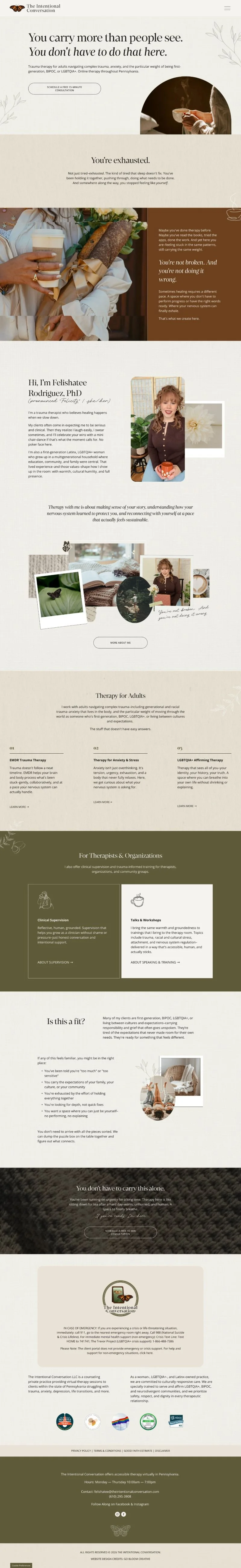
Felishatee Rodriguez’s design brief is one of my most memorable to date. The problem she needed to solve? Her existing site felt too serious. Too academic. Clients were meeting her in person and noting the mismatch. She's warm, funny, down to earth, someone who brings her whole human self into the therapy room. She’s a PhD who’s not above a well-timed, very human curse word in a session. 😆 The new site needed to close that gap and truly represent her.
On top of that, the language she used to describe her vision was beautiful. She wanted the site to feel like "a quiet cup of tea after a really hard day." Not a sales page. But a doorway.
So this design leans into warmth through cozy textures, spacing, and personal touches everywhere. Nothing is rushed. The pace of the site itself mirrors the pace she brings to her work: present, steady, unhurried.
What makes it feel warm & natural:
Warm-toned earthy, palette
Generous white space that slows the visitor down
Gentle scrolling moving-giving the site a feeling of life
Cozy textures woven throughout
Copy and design working together to create a feeling of being seen before being sold to
Graphics that feel sketched by a human being (rather than polished or glossy)
What keeps it feeling focused & easy to navigate:
Strong typographic hierarchy
Clear, grounded copy that has her unique voice-like an intentional conversation between her a client
A coherent point of view running through every page that doesn’t over-explain or get too academic
Elegant & Refined Web Design
Timeless. Trustworthy. Nothing superfluous.
An Elegant & Refined website is all about restraint. 1 to 2 fonts. A spare color palette. Layouts that feel carefully considered rather than whimsical.
This aesthetic tends to work beautifully for therapists whose clients are coming to them specifically for expertise and reliability. The design is saying: this person knows what they're doing.
Lisa Pierce, LICSW
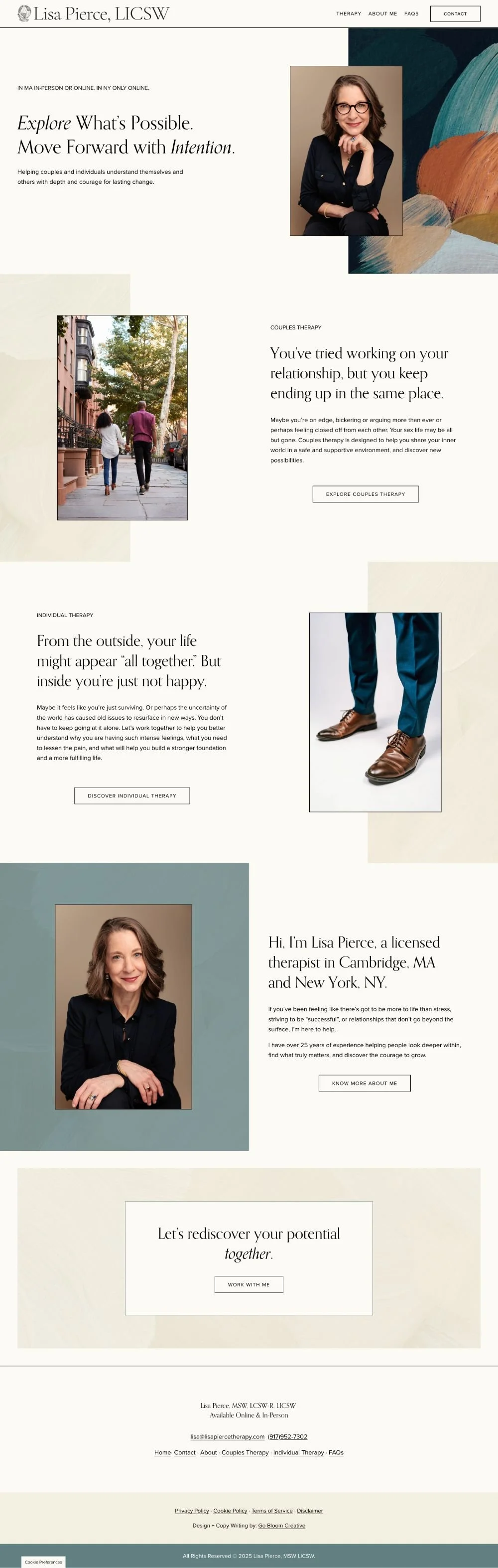
Lisa Pierce is a psychodynamic psychotherapist and EFT couples therapist based in Cambridge. Full disclosure, Lisa and I were colleagues and friends before I ever designed her site, so I can say this: as a person, she is genuinely elegant. So the question with her site was never whether it should feel refined. It was how to get there without making it feel too flat or too soft.
When we refreshed her site (I wrote a whole article about how I refreshed and modernized her website here), we looked to her office itself for inspiration. The artwork on her walls had an abstract, painterly quality; layered, rich, complex–just like the works she does with her clients. With that in mind, I brought in beautiful hand-painted background textures that echoed the same energy. It was a small decision that gave the site the same vibe as the space her clients actually walk into.
What makes it feel elegant:
Painterly, abstract backgrounds that add depth and texture without clutter
Strong typography with a classic feel
A color story pulled directly from the therapist's own environment mixing soft neutrals with some intentional bold pops in the paintings
What makes it feel refined rather than stiff:
The abstraction of the imagery (it’s evocative rather than literal)
Warm undertones in the palette that keep it from reading as corporate
A design point of view that is threaded through the entire site in an intentional way
Dr. Shelly Orlowsky

Dr. Shelly Orlowsky works with moms who are overwhelmed, feel lost in their own lives, and scared to admit how hard things actually are. What they need from a therapist, before anything else, is the sense that this person is completely solid.
For a client who feels she is barely holding it together, landing on a site that feels this organized and reliable is its own form of calm reassurance.
That's exactly what her website communicates. The palette is quiet and restrained-soft but not overtly feminine. Single font throughout. Symmetric, balanced layouts. Every choice is meant to demonstrate that steadiness that her clients are seeking.
What makes it feel elegant:
Timeless font used consistently throughout
Streamlined palette–just 4 colors!
Symmetric, balanced layouts that never feel cluttered
Thin borders between sections and around buttons
What makes it feel refined:
Rounded letterforms that soften the formality
Sparing use of a warm accent color to add just enough approachability
Professional photography in a clean, soothing setting
Clear, organized copy and site navigation
Creative & Expressive
Vibrant. Intentional. Rich in meaning.
A Creative & Expressive website feels it couldn't belong to anyone else. Color does real work here. So does imagery, texture, movement. Each element is chosen with a story behind it.
This therapist is usually a pretty visual person and they come to the process with lots of ideas. The process of creating their website is usually about refining rather than idea generation. This aesthetic tends to attract therapists who bring creativity directly into their practice–art therapy, somatic work, experiential approaches.
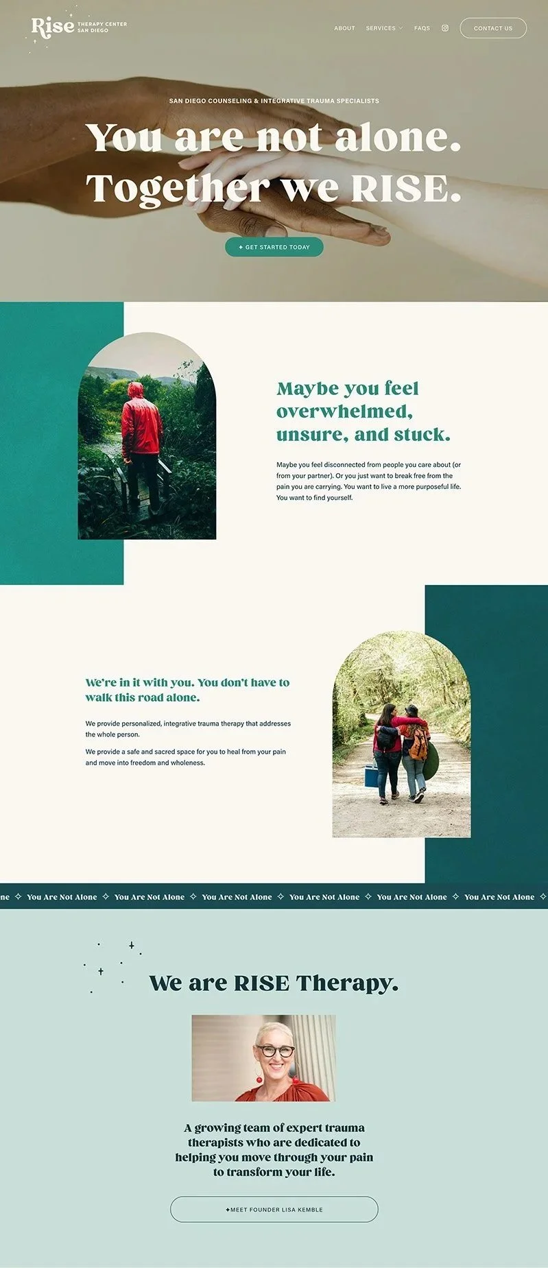
RISE Therapy San Diego
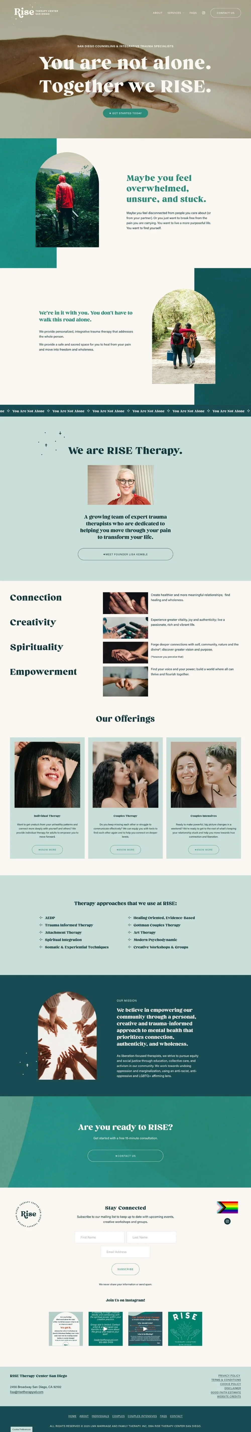
Lisa Kemble built RISE Therapy around four core values: Connection, Creativity, Spirituality, and Empowerment. So the design brief was to build a site where those values weren't just stated, but felt by every visitor who walks through the virtual door.
The result is one of the most visually distinctive therapy sites I've designed. Teal and red pops (not the easiest color palette-but each color is full of meaning for Lisa and it came together seamlessly). Starburst sparkle elements that reference the mid-century aesthetic Lisa was drawn to. Interactive site animations built with custom code. Lots of movement throughout.
What makes it feel creative:
Layered textures that give the site visual depth
Custom sparkle/starburst elements with a modernized mid-century feel
Bold use of deep teal against warm neutrals with red pops
Imagery chosen for emotional resonance and symbolism
What makes it feel expressive:
A clear visual hierarchy that keeps the eye moving purposefully
Design elements that mirror the practice's stated values
Consistent use of a small number of motifs rather than lots of visual noise
All Kinds of Love Therapy
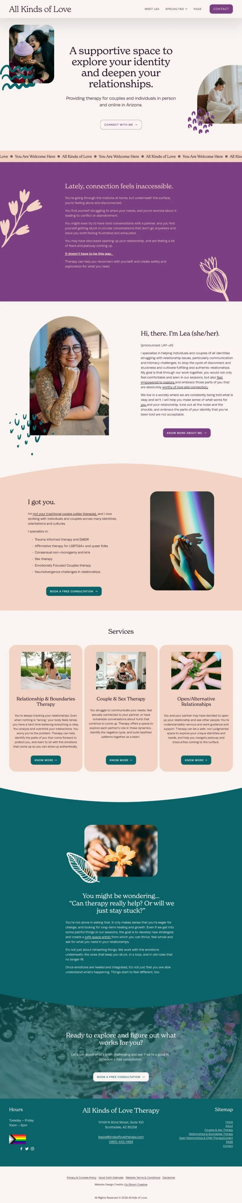
Dr. Lea Barber specializes in relationships, identity, and ethical non-monogamy — and she wanted a site that would make people feel immediately, unmistakably welcome. Not in a vague, everyone-is-welcome way. In a specific, I-see-you way.
The palette we landed on–warm peach against deep teals and purples–does exactly that. It's warm enough to feel safe and unexpected enough to show personality.
Note: Lea has since updated her logo ,brand photos, and did some SEO work since we completed this project, but the design direction, layout, and color story shown here are as we originally built them. And this is a great example of how a site can evolve over time!
What makes it feel creative:
Warm peach, purple and deep teal–an unexpected palette that feels fresh and meaningful
Illustrations that add personality without overwhelming the layout
Photography chosen for emotional and symbolic resonance
What makes it feel expressive:
Organic shapes and layered elements that feel welcoming
A visual warmth that draws people in before they've read a single word
Identity-affirming signals that are quietly woven in (rather than shouting)
Bold & Playful Website Design
Confident. Colorful. Unapologetically itself.
A Bold & Playful website doesn't hedge. It knows exactly who it's for, and it's not trying to appeal to everyone. The color palette is saturated. The fonts have personality. There's a sense of movement or energy. This is the aesthetic for therapists who are lovingly direct. The ones who show up with their whole heart and also tell you the truth. Their ideal client isn't looking for soft. They want someone who matches their energy, someone who will help them actually get somewhere. And if that's not you, this therapist is genuinely fine with that. They know who they are and know therapy works best when there’s a good fit.
Melisa Janosek Therapy
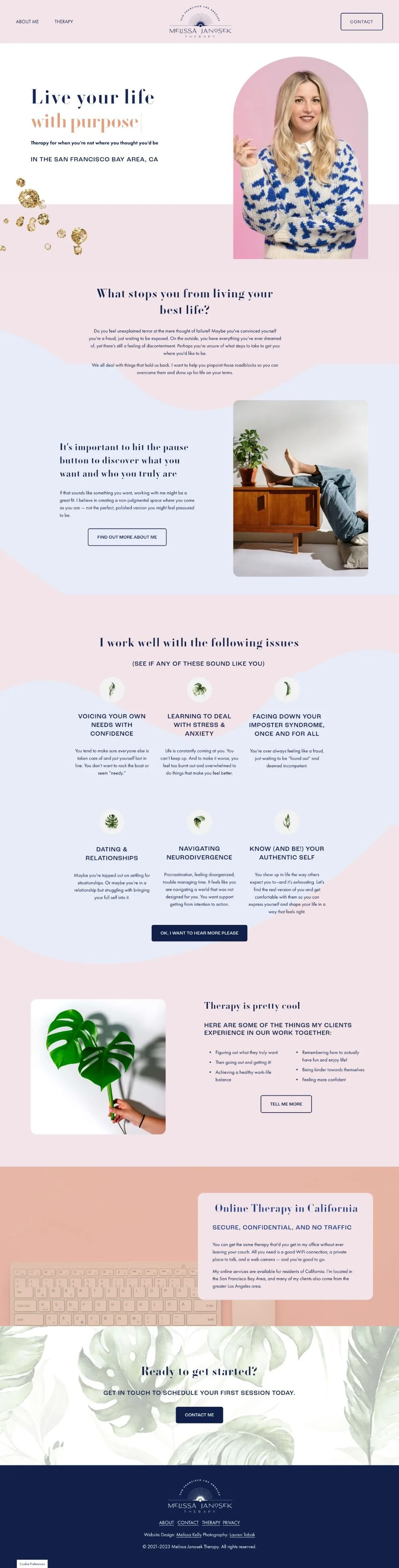
Melissa Janosek knew what she wanted: bold, standout, completely her. Her palette includes bubblegum pink. We’ve got personality-driven fonts, gold glitter spatters, and animation–but it all works together. Why? She knows that the right clients will see her site and feel instant recognition…and if they don’t that’s OK too. She is not trying to be for everyone.
After her site launched, she told me she'd noticed an increase in consultation requests without much marketing–and was recruited by a referral company specifically because, she was told, her website stood out from others. She's been one of the clearest examples I've seen of what happens when a therapist stops designing for everyone and starts designing for their people.
What makes it feel bold:
Bright, unapologetic color palette
Animation and movement
Gold glitter, custom icons, and wavy backgrounds (details that declare a personality)
Dramatic fonts with presence and personality
What makes it feel playful but still professional:
A coherent color story that holds the maximalism together
Design personality that matches the therapist
Energy that signals: this therapist will actually help you get somewhere
Lisa Listerman, LICSW

Lisa Listerman, LICSW
Lisa works with perfectionistic, high-achievers who are successful on paper and exhausted underneath. Some of her work is around helping her clients to "ride the wave":moving with the unexpected ebbs and flows of life instead of being knocked flat by them.
Water is woven through the entire design: wavy section dividers, water-themed backgrounds. Because Lisa's clients are high-achieving, structured people the site isn’t totally flowy or loose. We’ve also go clean lines, 90-degree angles, balanced layouts. This site is such a good example of how a a therapeutic concept can become a visual.
Her color palette was entirely her idea: coral, light blue, dark cornflower, off-white with text highlighters and an italic accent font adding small unexpected details. The site feels like Lisa herself apparently does: engaged, concrete, with a sense of humor hiding just underneath the surface.
What makes it feel bold:
A confident, unexpected color palette that doesn't borrow from therapy-site conventions
Text highlight accents that draw the eye
Italic font as a recurring visual motif
What makes it feel playful:
Water-inspired design elements that reflect her actual therapeutic approach
The tension between fluid wave details and clean, structured layouts
A design that says: I'm serious about my work, and I also know how to go with the flow and have a sense of humor when the time is right
Clean & Minimal Web Design
Quiet. Considered. Enough.
A Clean & Minimal website operates on the principle that less is more. The photography is sparse and carefully chosen. The copy is honed down to exactly what needs to be there. The white space is doing active work by giving the eye room to rest and take in the written content. This aesthetic communicates confidence and intentionality.
Psych Garden

Psych Garden’s web design is minimalism with a point of view. It doesn't feel bare, but rather carefully edited. The imagery is unexpected (rather than go with gardens and flowers because of the name, we talked about plants in various stages of growth-not neat or tidy-to reflect the process of addictions recovery). We chose evocative rather than on-the-nose. The navigation is clean and uncluttered. The font choice is distinctive enough to give the site real personality without adding visual noise. Everything earns its place.
What makes it feel minimal:
Few, carefully selected images chosen for their resonance, not just decor
Restrained use of graphic elements like spare lines, borders, small, structured botanic icons
Generous white space throughout
Uncluttered navigation
A distinctive, modern font that carries real personality
Find Your Design Language
Still not sure what you're drawn to? Here's a quick reference–words that tend to cluster together in each aesthetic, and a template that fits each one best if you need a place to start.
Warm & Natural
Synonyms:Clean, earthy, grounded, calm, approachable, human, cozy, relaxed, rustic, nature-inspired
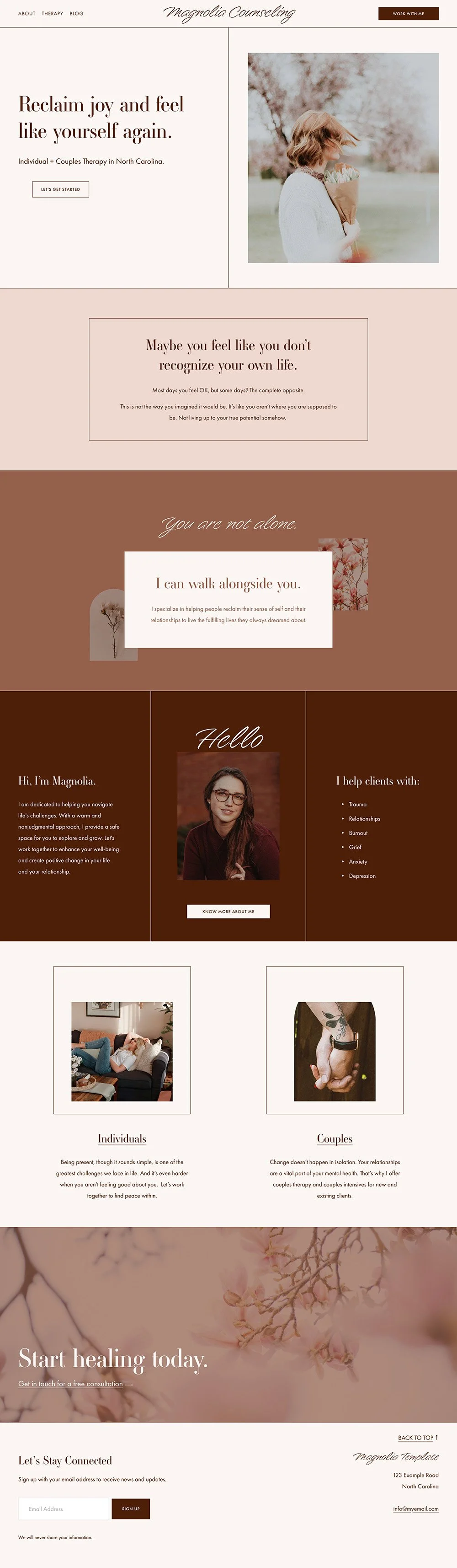
Template match: Magnolia
Elegant & Refined
Synonyms: Polished, timeless, sophisticated, balanced, classic, quiet, restrained, trustworthy
Template match: Lilac
Creative & Expressive
Synonyms: Vibrant, intentional, fresh, bright, passionate, alive, authentic, distinctive
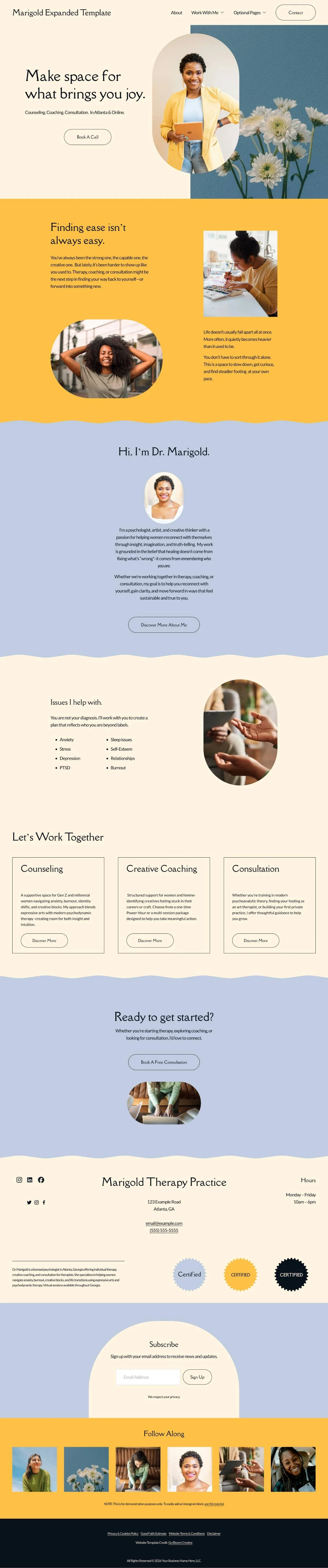
Template match: Marigold
Bold & Playful
Colorful, energetic, joyful, dramatic, friendly, confident, approachable, unapologetic
Template match: Poppy
Clean & Minimal
Simple, sleek, light, crisp, considered, quiet, intentional, unfussy
Template match: My minimal template is coming soon — join the newsletter to be the first to know when it launches.
Ready to create your own beautiful private practice website?
If this post got your wheels turning but you're not sure where to start, grab the free Therapist Website Prep Toolkit. It'll help you organize your content, clarify your brand direction, and feel confident before you ever touch a template or talk to a designer.
Already know you're ready? Browse the templates →