How to Choose Colors for Your Therapy Website (Without Spiraling on Pinterest)

You've saved 47 color palettes on Pinterest. You've read three articles about color psychology. You've stared at your website builder wondering which color goes in which slot.
And you're no closer to actually picking your website colors than you were two hours ago.
Here's the thing: choosing colors for your therapy website doesn't have to be this hard.
In this post, I'm going to walk you through the simple framework I use when building therapy websites. You don't need a degree in graphic design or a "perfect eye" for color (and you need way fewer colors than you think!).
Why Choosing Colors Feels So Overwhelming
Generic color advice doesn't help you when you're actually building a website. You can read all about how blue evokes trust and green suggests growth, but that doesn't tell you which blue, or what to pair it with, or which color goes where.
Then you hop online to a site like Pinterest and suddenly you're drowning in gorgeous palettes but you have no idea which direction is "right" for your practice.
Here's the good news: you don't need to choose a million colors. You really only need about five.
And once you understand how those five colors actually function on your website, the decisions get a lot easier.
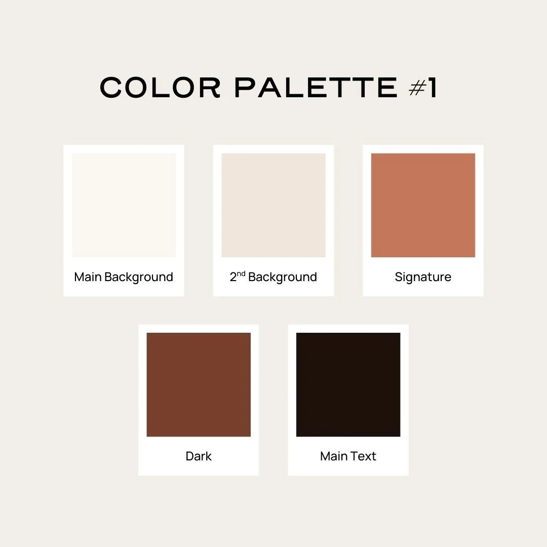
The Only Five Colors You Actually Need for Your Website
Here's the framework I use. You need five colors, and each one has a specific job:
Main Background Color → The color behind most of your content (usually white or off-white)
Light Secondary Background Color → For section breaks, cards, alternating sections, creates visual variety
Accent Color → Your pop of color—buttons, links, highlights. This is your “signature color” (more on that in a minute)
Dark Background Color → For contrasting section backgrounds like footers or feature areas, again to create visual variety
Main Text Color → Your main body text (usually black or near-black-can also be used for a dark section background if you like)
That's it. Five colors, five jobs.
You're choosing colors that work together as a system that you can use, rather than just picking five pretty colors.
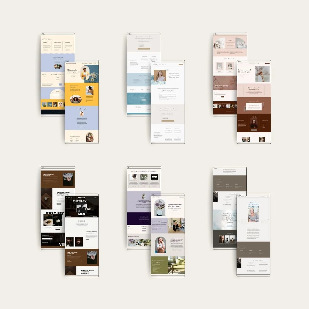
Here’s an example:
(This is the Lilac Template from my Template Shop, btw)
And here's a secret: you can even get away with just three or four colors. 😬 I've done this on several client sites and it works beautifully. When you are DIYing, keeping it simple is the way to go, because it will allow you to be more consistent, and that’s what makes a site look polished.
How to Get Started: Choose just ONE Signature Color
Here's my biggest piece of advice: don't try to choose all five colors at once. Start with ONE–your “signature” or accent color.
This is the color that will pop up on your buttons, your links, your highlights. It's the color people will associate with your brand. Then, you build the rest of the palette based on this one.
So how do you choose it?
1) Think about your ideal client
Color psychology is useful, but only when you connect it to who you're trying to reach. Instead of thinking abstractly about what colors "mean," think about the person landing on your website at 3am, anxious and searching for help.
What do they need to feel most?
Calm and grounded? Think soft blues, sage greens, muted earth tones
Energized and hopeful? Consider warm corals, golden yellows, soft oranges
Safe and trusting? Navy, deep teal, or classic blue-grays tend to read as trustworthy
Seen and validated? Warmer, approachable tones, like dusty rose, terracotta, warm neutrals
There's no universally "right" answer. A somatic therapist working with trauma might lean toward grounding earth tones. A therapist specializing in creative professionals might go bolder. A couples therapist might want something soft and warmer.
2) Make sure it feels like you
You're going to see this color on every single page of your website. It'll be on your business cards, your social media, maybe even your office walls someday. So it needs to feel like you–not just strategically "correct."
If you hate orange, don't pick orange just because some article said it's energizing. You have to live with this color.
3) Don’t pick it because it’s trending
Be wary of super-trendy colors. Unless you are someone who plans to update your site every year (which I don’t recommend) choose colors that will stand the test of time. You want this color to be associated with you and your “brand” and that won’t work if you’re always changing it.
Now, Build the Rest of Your Palette From That One Choice!
Once you've chosen your accent color, the rest falls into place more easily than you'd think.
Main Background Color
This is almost always going to be white, off-white, or a very pale tint of your signature color (think like a whisper of blue or a yellow that’s so pale it’s nearly white) You don't need to overthink this one.
One tip: I generally stay away from pure white. A soft off-white or warm shell color feels a little less stark and more inviting. But as long as there's enough contrast with your text, you're fine.
This color also does double duty–it becomes your text color on dark backgrounds!
Secondary Background Color
This is for creating visual variety so it should be distinct enough from your main background color to create a bit of contrast.
Options that usually work:
A very muted, soft version of your accent color
A complementary neutral (warm gray, soft beige, pale sage, light taupe-you can almost never go wrong with these because they are neutral)
A super pale version of your dark color
One thing to keep in mind: your main text color (aka, the darkest one) needs to be able to show up against this background color. This is for readability (more on checking that in a minute.)
Dark Background Color
This is for sections where you want more drama or contrast—often footers, call-to-action sections, or feature areas.
Good options: deep navy, charcoal, forest green, dark slate, espresso brown. Something that creates contrast without being harsh pure black.
You can also skip this one entirely—if you want a simpler palette, you can make your dark background color and your text color the same. Four colors is completely valid.
Main Text Color
This is your primary text color for light backgrounds. Most website builders will automatically apply it whenever you have a light section.
I recommend going with something very dark but not pure black. A soft black, dark charcoal, or very deep version of your accent color tends to look richer and feel less stark. It's also easier on the eyes, especially for longer paragraphs.
The Formula in Action
Let's say you chose a warm terracotta as your accent color. Here's how you might build out the rest:
Main Background: Soft cream (#FAF7F2)
Secondary Background: Warm beige or pale blush (#F0E6DC)
Accent: Terracotta (#C4775A)
Dark Background: Deep brown (#77402C)
Text: Dark roast coffee brown (#1E100B)
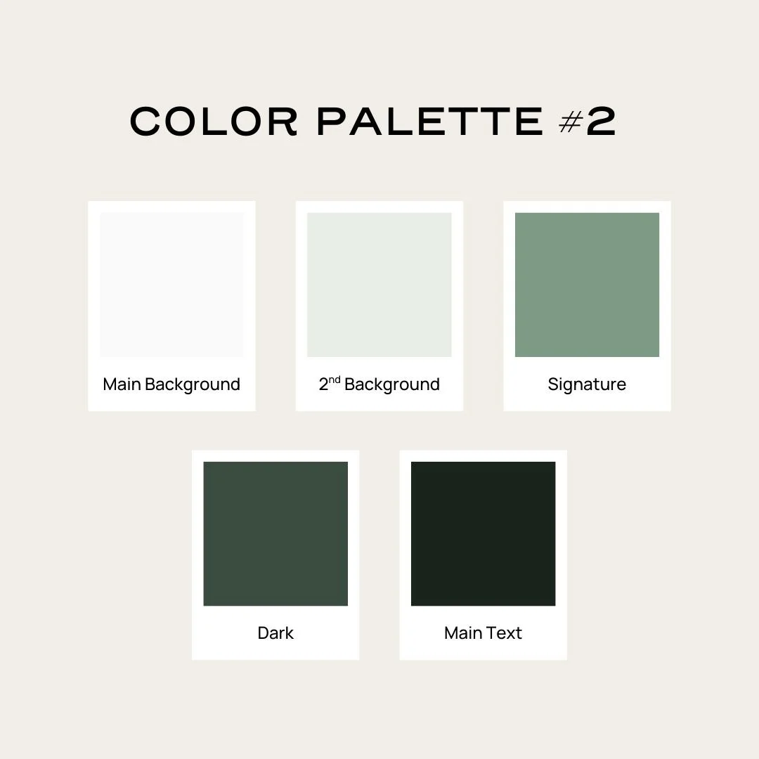
Or maybe you went with a calming sage green:
Main Background: Clean almost-white (#FAFAFA)
Secondary Background: Pale sage (#E8EDE6)
Accent: Sage green (#7D9B84)
Dark Background: Deep forest green (#2C3E32)
Text: Dark gray-green (#19241C)
“What the heck is that hashtag with the letters and numbers?”: A quick note on HEX codes.
You'll notice that when you see color palettes, you’ll often see something like #FAF7F2 or #C4775A next to each color. These are called hex codes (short for “hexadecimal” 🥵), and they're basically the universal language for colors on the web.
A hex code tells your website builder precisely which shade you want. "Terracotta" could mean a hundred different things, but #C4775A is one specific color.
You'll need these hex codes to plug your colors into your website builder. The good news? Any palette tool (like Coolors or Adobe Color–more on these below) will give you the hex code for every color. Just look for the # followed by six letters and/or numbers, and copy-paste it into your site settings.
Ideas on How to Use Your Signature (aka, Accent) Color
Imagine a pie chart of how your colors appear on your website. Your signature color might take up the smallest slice, but it's the most memorable because it pops against everything else.
Here are some ways you might use your signature color:
Buttons
Links
Underlines or text highlights
Shape blocks or borders
Occasional accent sections (sparingly)
How to Check If Your Colors Are Readable Together (aka, Accessible)
Bottom line: Your text color needs to be readable against your background color.
I often see people using low-contrast color on websites, and while I understand that aesthetically that might look pretty-to some it might be completely unreadable and this creates an alienating, inaccessible experience for visitors and that’s not what we want (especially on a therapy website).
Rather than trying to guess, you can use a free contrast checker like WebAIM's Contrast Checker. Pop in the hex codes for your text color (they call it “foreground”) and background color, and it'll tell you if the contrast ratio passes accessibility standards.
Setting Up Your Colors in Squarespace
If you're using Squarespace (like I do for all my client sites and templates), I've got a video walkthrough that shows you exactly how to plug your colors into the platform. I'll walk you through where each color goes, how the section color themes work, and a few quirks to watch out for.
Using a different platform?
The same principles apply! You'll just need to find where your platform stores its global color settings. Most builders have a "site styles," "design," or "theme" section where you can set your palette.
Tools to Help You Build Your Palette
If you want some help creating or refining your palette, here are my favorites:
Coolors — Great for generating palettes and adjusting individual colors. You can lock in your accent color and let it generate complementary options.
Adobe Color — Lets you explore color relationships (complementary, analogous, etc.) and extract palettes from images.
WebAIM Contrast Checker — For making sure your color pairings are accessible.
Common Mistakes to Avoid
Using too many colors. You really only need 3-5. More than that gets chaotic and hard to manage.
Choosing colors you think you "should" use instead of colors that feel right. If every therapy website you see uses sage green but you hate sage green, don't use sage green.
Making your accent color your main background. Your bright, saturated accent color should be used sparingly. A whole page of bright coral is overwhelming.
Forgetting about contrast. If your light gray text on a white background is hard to read, it doesn't matter how pretty it looks.
Picking very trendy colors. That exact shade might feel dated in a couple of years. Slightly muted, classic tones tend to have more staying power.
Remember You Don't Need to Be a Designer to Pick Colors for Your Website
Start with one color that feels right for your practice and your clients, then build the rest around it.
That's it. Five colors. One signature. Stop sprialing on Pinterest now. 😆
Ready to get your website foundations in order?
Grab my free Therapist Website Toolkit—it'll help you organize your content, clarify your brand, and feel confident before you start designing.
Want a head start on your design?
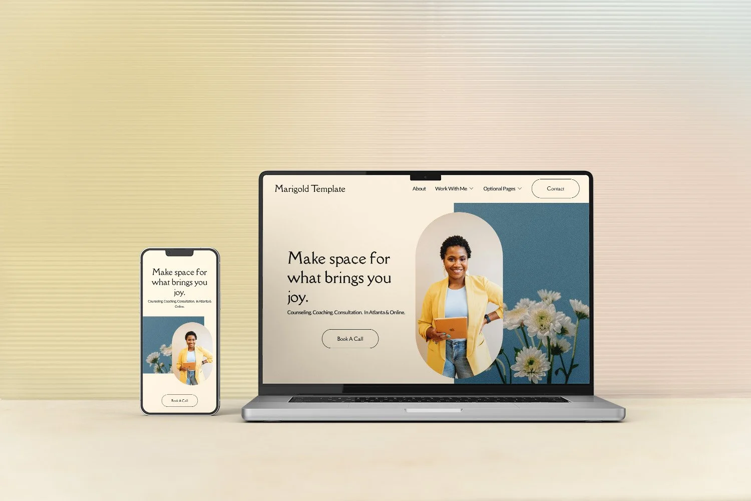
Check out my Squarespace templates for therapists, where the color system is already built in—you just swap in your palette.