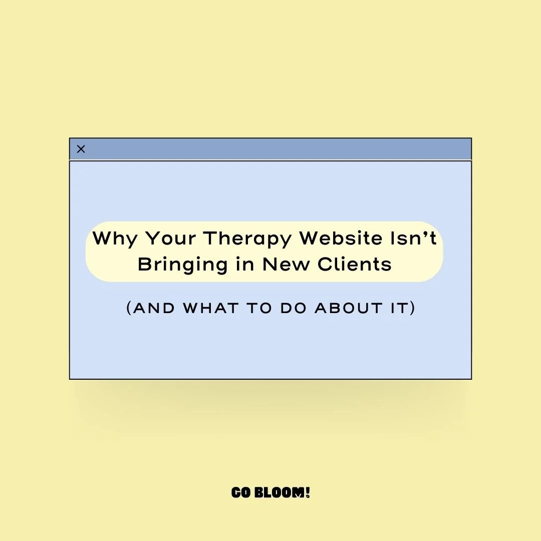
Therapy Website Design for Non-Designers: What Works, What Doesn't, and Why
You've opened your website builder. You've got coffee and good intentions.
And then you see all the choices. The colors, the image shapes, the underlines, the wavy section dividers...and suddenly, your website starts looking “off” but you aren’t totally sure why. You just know it isn’t what you were hoping.
This post is here to help.
I'm going to walk you through the simple core design principles I use on every therapist website I build. I’ll show you what they look like when they go right, and when they go spectacularly wrong. 😅
Watch: What Makes a Therapy Website Look Professional (And What Doesn't)
In this video, I walk through one of my website templates for therapists to show you the thinking behind design choices and then contrast it with a "disaster version" I built (based on real therapist mistakes I’ve seen, seriously) to show you what goes wrong.
Core Principles of Good Web Design (For Non-Designers)
These aren't rules I invented. They're the same principles professional designers use every day. I'm just translating them for therapists with a practice to run and better things to do than study typography.
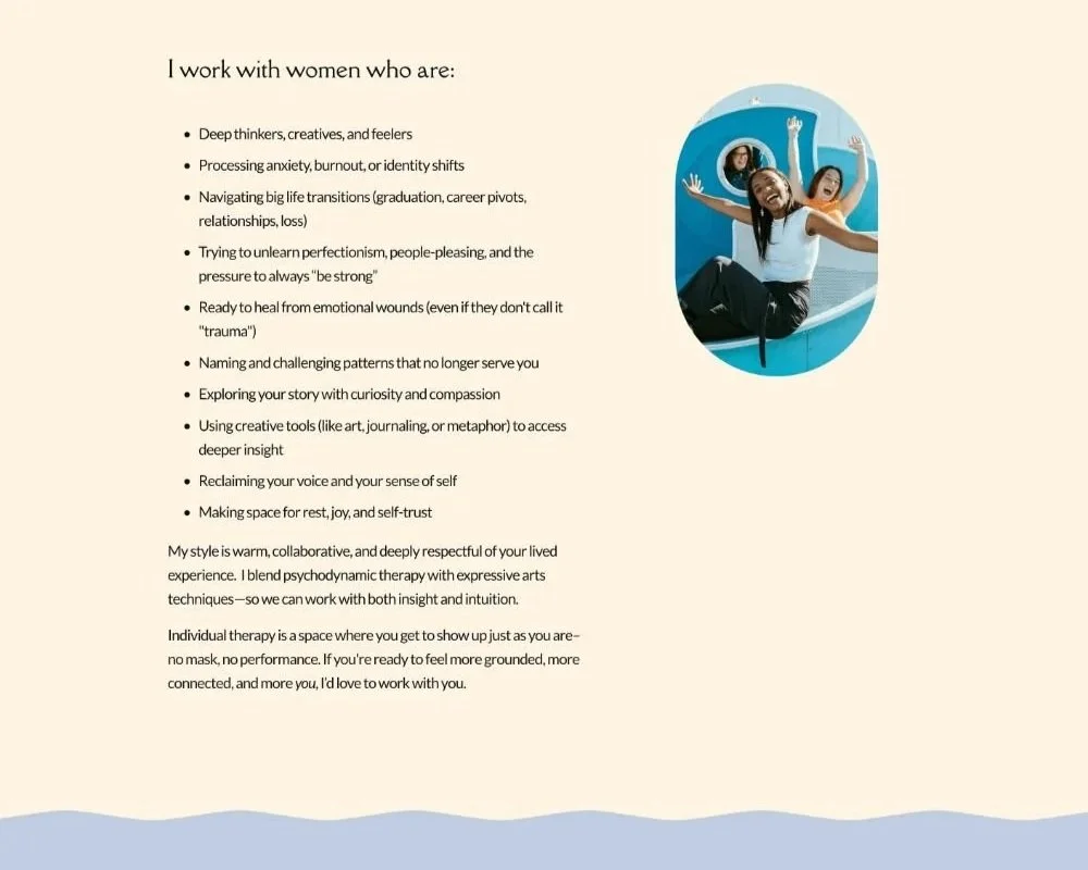
1) White Space (aka Breathing Room)
White space doesn't mean your website looks empty or boring. It means your content has room to land. Just like you aren’t going to bombard a therapy client with info-your website needs that same pacing to allow visitors to take information in.
Top things to check for:
Is there space between each element in a section (example, photos, text, and buttons)?
Is there space on the top and the bottom of the section? And is that space about equal ?
Are your large sections of text broken into smaller chunks to avoid a “wall of text”?
Remember this: adding space doesn’t mean a) people will miss things or b) that a section is too plain or boring. Space=pacing. And pacing should fit your client.
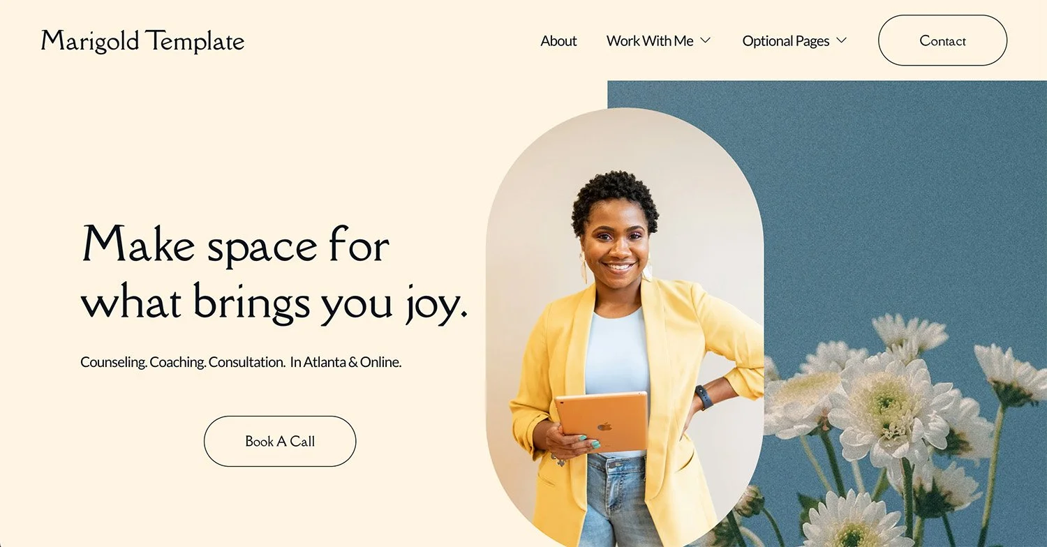
Plenty of White Space
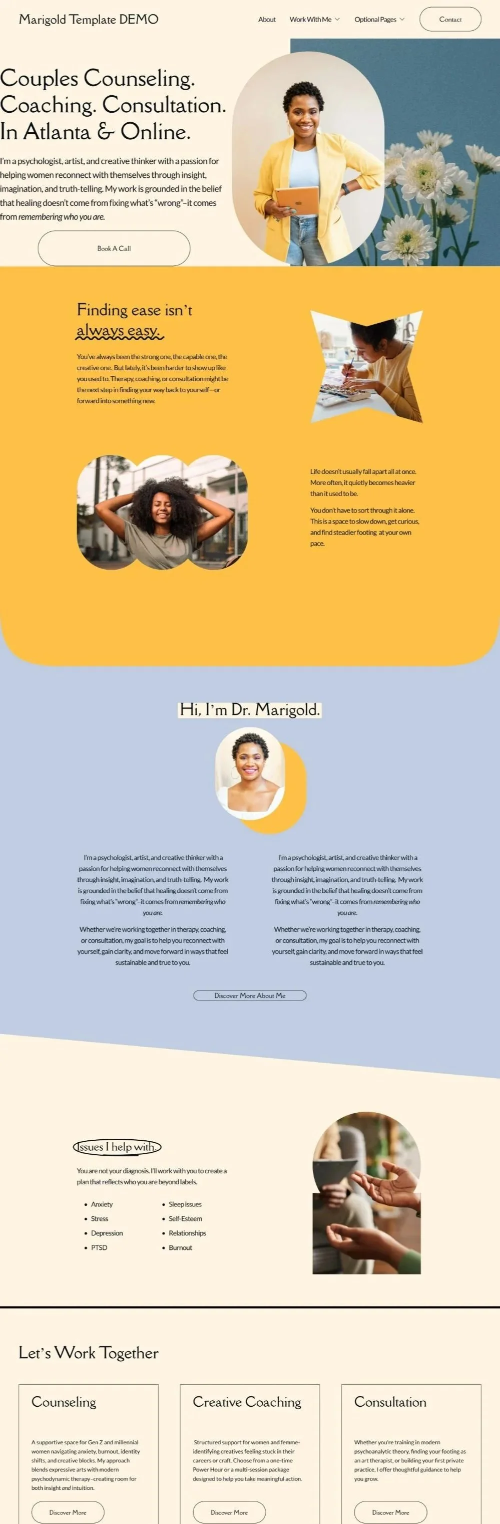
Not enough white space
2) Consistency & Cohesion
Consistency and Cohesion mean using the same themes from one page of your site to the next. This principle is the one that will really give a DIY site a professional feel. I completely get the temptation to try every design style (trust me, I’ve been down my fair share of design rabbit holes). But when too many different design choices are happening on your site it stops looking intentional.
Top things to check for:
Are you using the same font styles (aka, bolding, capitalization, italics, etc) throughout the entire site ?
Are your image styles consistent (e.g. 2 shape styles, not 10, black and white or color-or if mixed then a balanced mix on each page)?
If you have a design accent — an underline style, a decorative element, a color pop — does it show up on each page? Or just randomly on one page?
If you are using section dividers or borders, do you have just one or two styles you are using across the whole site? Or does each page have it’s own style?
Remember this: repetition isn't boring. It's what makes a site feel intentional. Every time a design element repeats, it reinforces your brand rather than distracting from it.
Too many ideas, feels chaotic
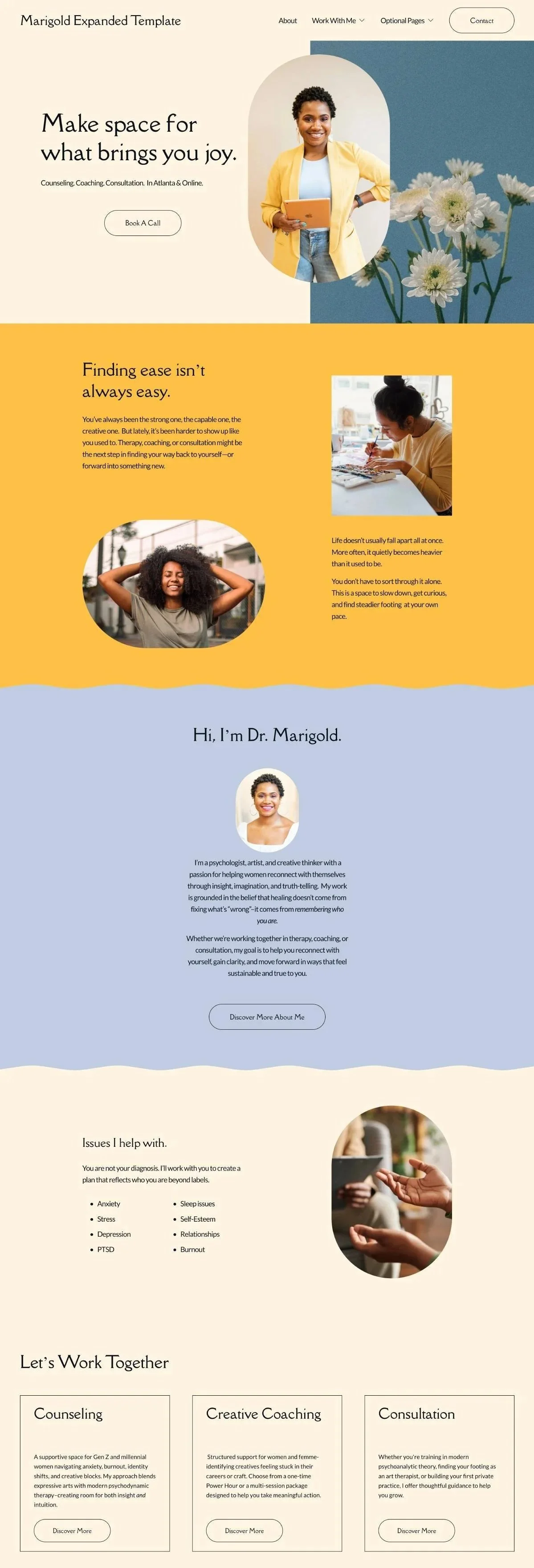
A few intentional choices that repeat
3) Balance
Balance is about making sure the elements within a section feel proportional to each other. Think of it like a seesaw — if one side is much heavier than the other, something feels off, even if your visitor can't explain why.
Top things to check for:
If you have a text block paired with an image, are they roughly the same height? Or does the text run way longer than the image beside it?
If a section has a lot of text, is there something — a visual break, an image, some white space — to balance it out?
Is there more white space on one side of the section than the other? Top and bottom, left and right should have roughly the same white space.
Remember this: balance doesn't mean everything has to be perfectly symmetrical. It just means nothing should feel like it's tipping over. If it’s off balance, it should be intentionally so and back to consistency, that choice should appear on each page.
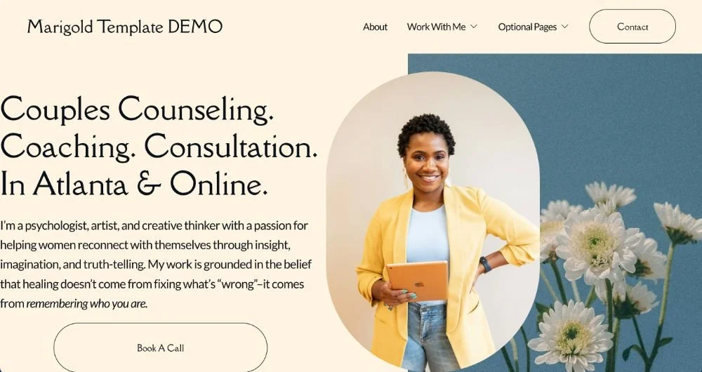
Balance between image and text
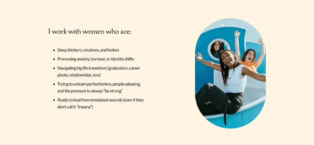
Unbalanced Image and Text
4) Photography
Photos should have a reason to be there. Rather than pretty, think about the connection to your client or your work. It doesn’t mean every photo needs to be literal, but it should be connected to something you are communicating to your client (don’t worry, I have some examples below!) and/or connected to what you are saying in that section.
Top things to check for:
Do your images complement your site’s color palette? And do the images all have a similar color palette to one another?
Are you using any therapy website clichés like stacked rocks, ocean vistas with no connection to your practice, the arms-outstretched-toward-the-sky pose? (Said lovingly: let them go!)
Does your about me section have an actual photo of you in it?
If you work with a specific population, does your imagery signal to them that this place is for them?
Remember this: stock photos are totally fine, but they should feel intentionally chosen. If an image could belong on any therapy website, it's probably not doing enough work for yours. (For more on this, check out How to Choose Stock Photos for Your Counseling Website.)
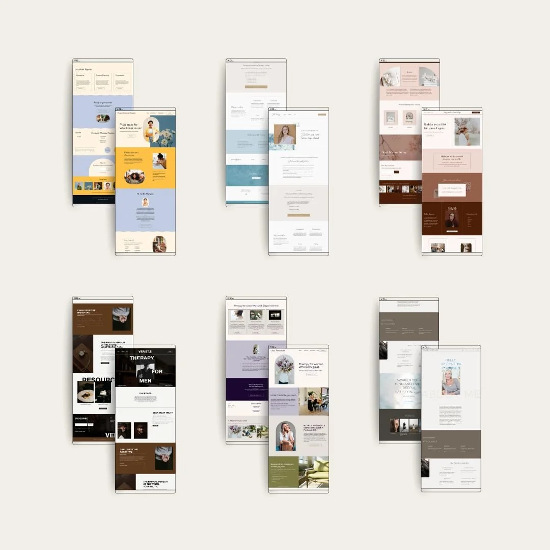
What This All Looks Like on Real Therapy Websites
Learning principles is one thing. Seeing them on a real site is another. Here are three examples from my custom web design clients, and what makes each one work.
The Intentional Conversation
Dr. Felishatee Rodriguez
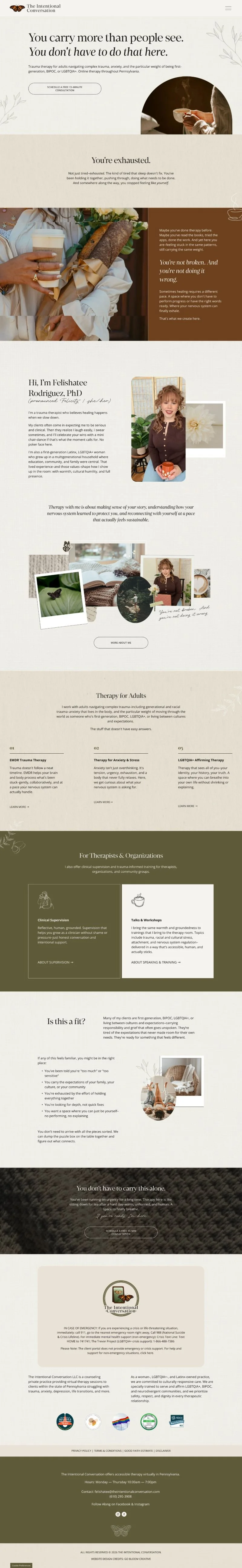
On this site, every element traces back to something Felishatee said, something she believes, something that lives in her actual work. Here's how her words became a design:
She wanted the site to feel like walking through a greenhouse. Comforting and warm. The kind of place where you might not look at every single thing, but you'll stop and sit with whatever speaks to you for a while.
Design style: Elements are scattered throughout in an organic, unhurried way, with greenery, plants, and nature woven in rather than arranged in a rigid structure.
She described therapy as pouring out all the puzzle pieces and sorting through them together. Naming things, pausing, taking time.
Design style: The polaroid-style photo collages on her service pages are a nod to that idea of sifting through memories without rushing.
Her clients run on espresso. Go-go-go, showing up to sessions with prepared answers like it's a work meeting. Her job is to help them slow down.
Design style: The site is built around tea. Illustrations of steaming cups appear throughout, and the site itself moves at an unhurried pace, like sitting down on a Sunday with a good cup and a good friend.
For Felishatee, butterflies go beyond the idea of metamorphosis. They migrate through seasons, leaving behind what doesn't serve them while remaining fundamentally themselves.
Design style: Butterflies appear sparingly throughout the design. Never on the nose. Always present.
Lisa Listerman, LICSW

Lisa's brief was equally rooted in her actual therapeutic approach. Here's how her work translated visually:
A core part of Lisa's work is helping high-achieving clients "ride the wave": moving with the unexpected ebbs and flows of life instead of being knocked flat by them.
Design style: Water is woven through the entire site. Wavy section dividers, water-themed backgrounds, fluid shapes throughout.
Her clients are structured and driven, so the site needed to have some stuctured elements too.
Design style: Clean lines and 90-degree angles hold the structure. The push and pull between fluid and grounded reflects her therapy approach.
Her color palette (coral, light blue, dark cornflower, off-white) gives you that unexpected, think-outside-the-box, not-so-buttoned-up feeling.
Design style: Text highlight accents and an italic accent font add small unexpected details. The overall effect feels like her personality: solid, professional, with a sense of humor just underneath.
The Design “FOMO” Problem
Website building platforms, like Squarespace, are fun to design in, and they have a ton of options. And if you're DIYing your site, you will be tempted to try them all.
This is how you end up with a wavy divider and a geometric border and three different underline styles and an italic accent font and a drop shadow on your images, all on the same page (see my chaotic image above). It’s how you end up with different design styles on each page!
What to do instead:
Make a short list of your design elements and stick to them on each page. Examples:
Pick your divider style: wavy or geometric, not both.
Pick your image style: shaped or not shaped-pick one or two styles and stop there
Pick your accent details (italics, decorative underlines, graphics) and use them consistently.
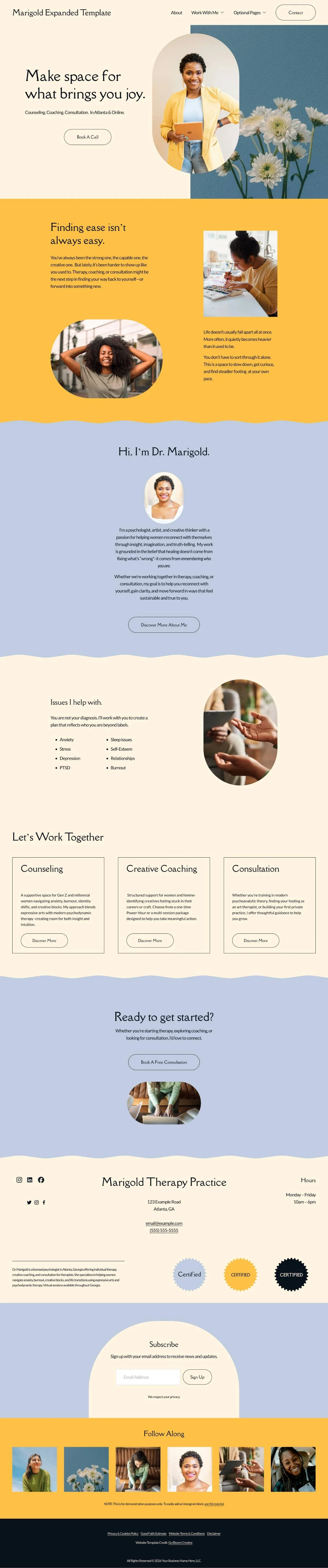
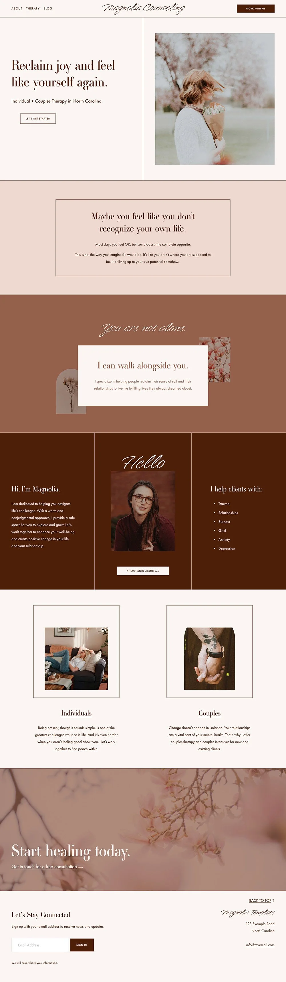
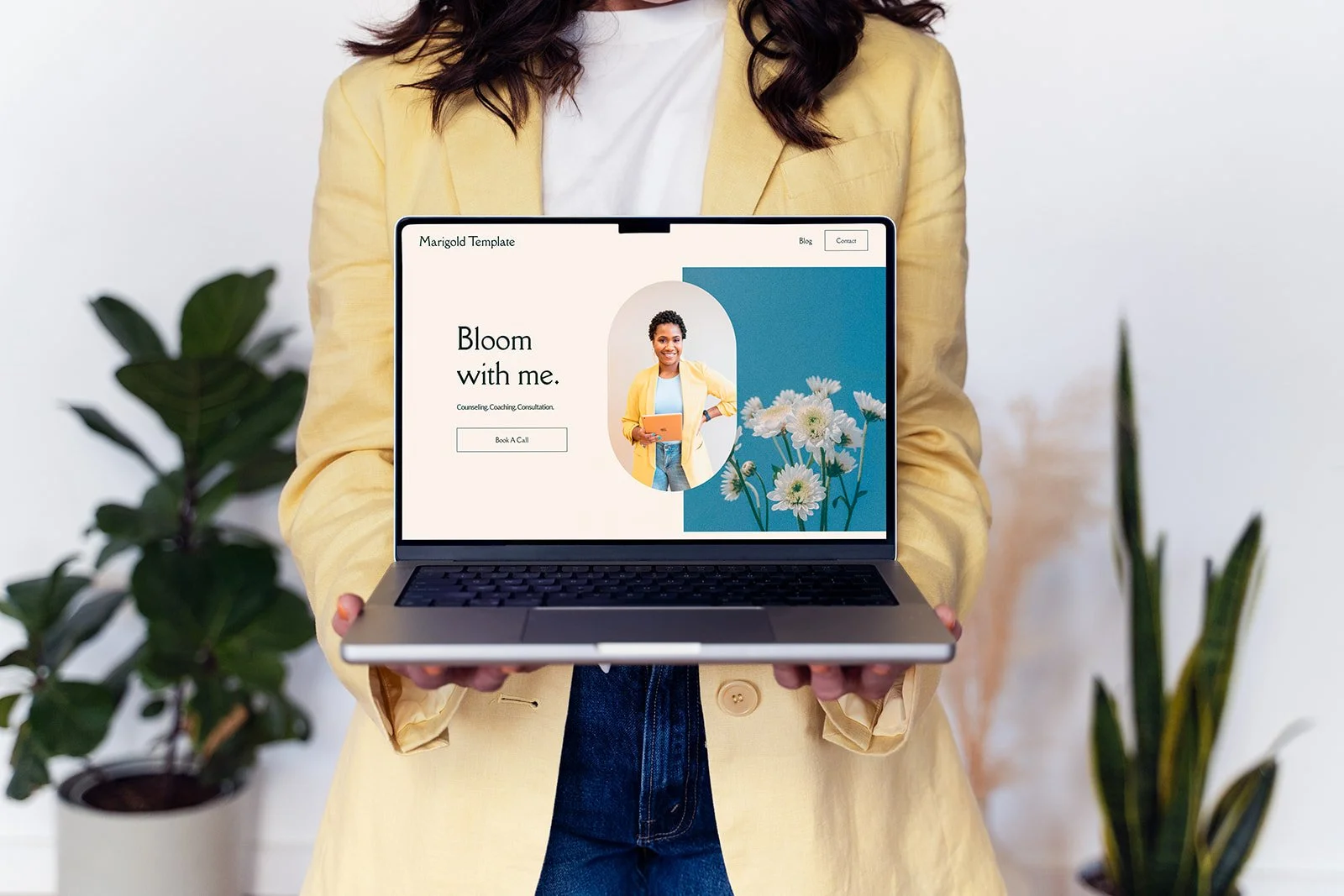
This is also why website templates can be super useful for non-designers. They've already made the consistency decisions. You're not starting with infinite options; you're starting with a coherent system and customizing within it.
Common Mistakes in DIY Therapist Website Design
These are pulled directly from the “disaster demo” in the video above (which are pulled from real therapist websites I've reviewed over the years):
No margins, content running edge to edge with no breathing room
Photos that have no connection to the therapist or the clients they serve (think tropical beaches when the practice is in upstate New York)
Centered text on long paragraphs (left-align your body copy because it's easier for the eye to track)
Text stretching too wide across the screen (hard to read, aim for no more than half the screen width)
Multiple border styles, underline styles, or image treatments used inconsistently
Sections with no space between them, so everything feels like one continuous wall
The page just... ends. No call to action, no next step
“But how do you know what works?”
All of the principles I’ve mentioned are good tools. But they only work when you know what you are trying to say and who you are saying it to.
Look back at those two sites. Felishatee's greenhouse feeling, her puzzle pieces, her tea-vs-espresso clients were all anchored in what she wants her visitors to know and feel about her. Lisa's water motif comes directly from how she thinks about her work and what her clients need from it.
Before you make your design choices, sit with one question first: when someone lands on your site, what do you most need them to feel?
If you want a good starting point for that thinking, my post on choosing colors for your therapy website uses color as the entry point (but the framework applies to every design decision you'll make).
And if you'd rather start with a design system that already has the consistency and structure built in, that's exactly what my Squarespace templates for therapists are for! You bring the content and the personality. The design does the heavy lifting.