Which Go Bloom Template is Right for You?
You've made it to the shop. You know you want a Go Bloom template. And now you're looking at all these completely different designs and thinking... okay, but how do I actually choose?
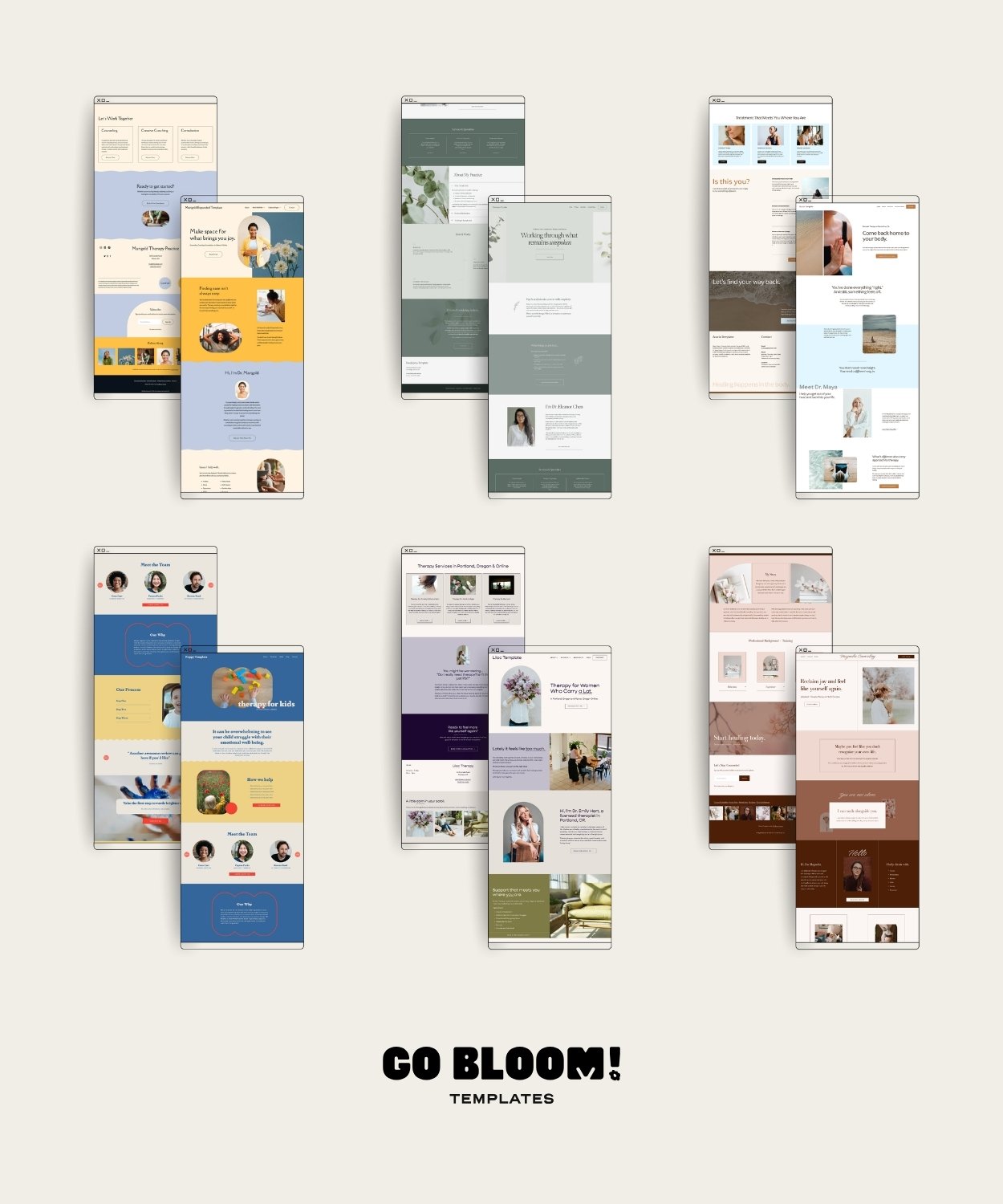
Here's an honest breakdown of every template in the shop, including who each one is for, what makes it distinct, and a few hints to help you land on the right one.
Before you choose: certain things that don't change across all templates
Every Go Bloom template has the same bones. Meaning, whether you buy Acacia or Poppy, you're getting the exact same behind-the-scenes experience. The difference is the look and feel. With every template you get:
My tried-and-true page structure, optimal for SEO
Mobile design built-in
Same support toolkit and writing guide
Also: none of these require Canva, code, or any outside software. Everything happens inside Squarespace. All the templates are intentionally built to be beginner-friendly.
Here’s a breakdown of the different features (and then below I will deep dive on each one).
Energy
Photos Needed
Best For
Not Ideal If…
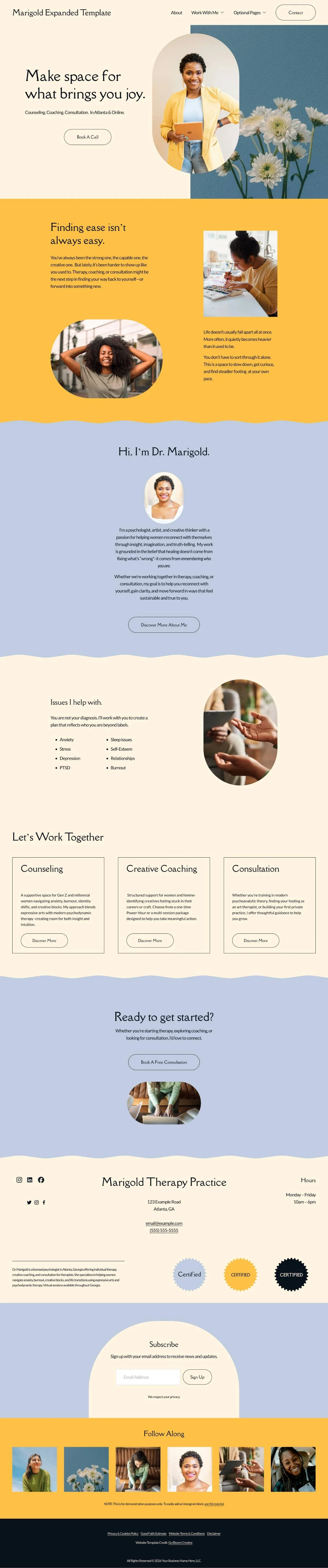
Marigold
Warm, energizing, forward-moving
6-8 per page
Growth work, burnout recovery, coaching, strengths-based or life transitions
Your approach is quiet and relational rather than growth-oriented
Eucalyptus
Clean, minimal, elegant
1-2 per page
Psychodynamic, insight-oriented work, minimal aesthetic lovers, anyone who's thought "I don't have enough photos for a nice website"
You prefer more imagery or a maximalist style
Poppy
Bold, personality-driven, specific
4-6 per page
Niche-focused practices (ADHD, children, young adults, LGBTQ+, creatives), therapists who are done playing it safe
You're not sure about bold design and prefer a quieter feel
Lilac
Soft, calming, safe, broad-appeal
6-8 per page
Anxiety, trauma, first-time therapy clients–anyone who needs a gentle approach
You want something with more edge or personality
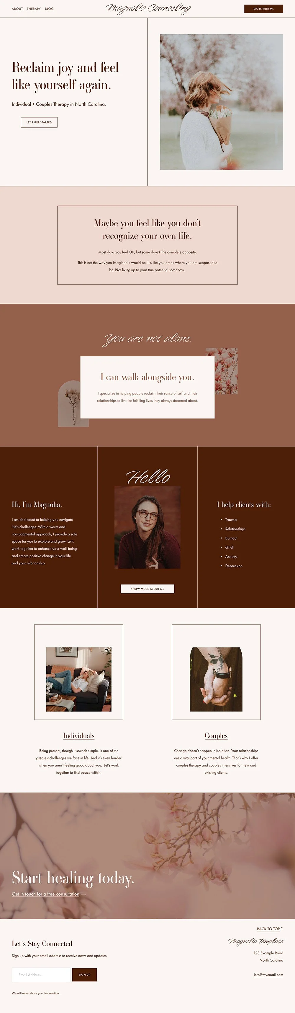
Magnolia
Polished, confident, quiet
6-8 per page
Established practices, complex trauma, couples therapy
You prefer softness over structure
Acacia
Light, airy, open, coastal
8-10 per page
Somatic, body-based, and holistic therapists, anyone wanting a calm and airy feel
You don't have many photos or don't want to build a library using stock (you can use the ones in the template if you want!)
Marigold
Warm, energizing, forward-moving.
The one for people that are ready to change.
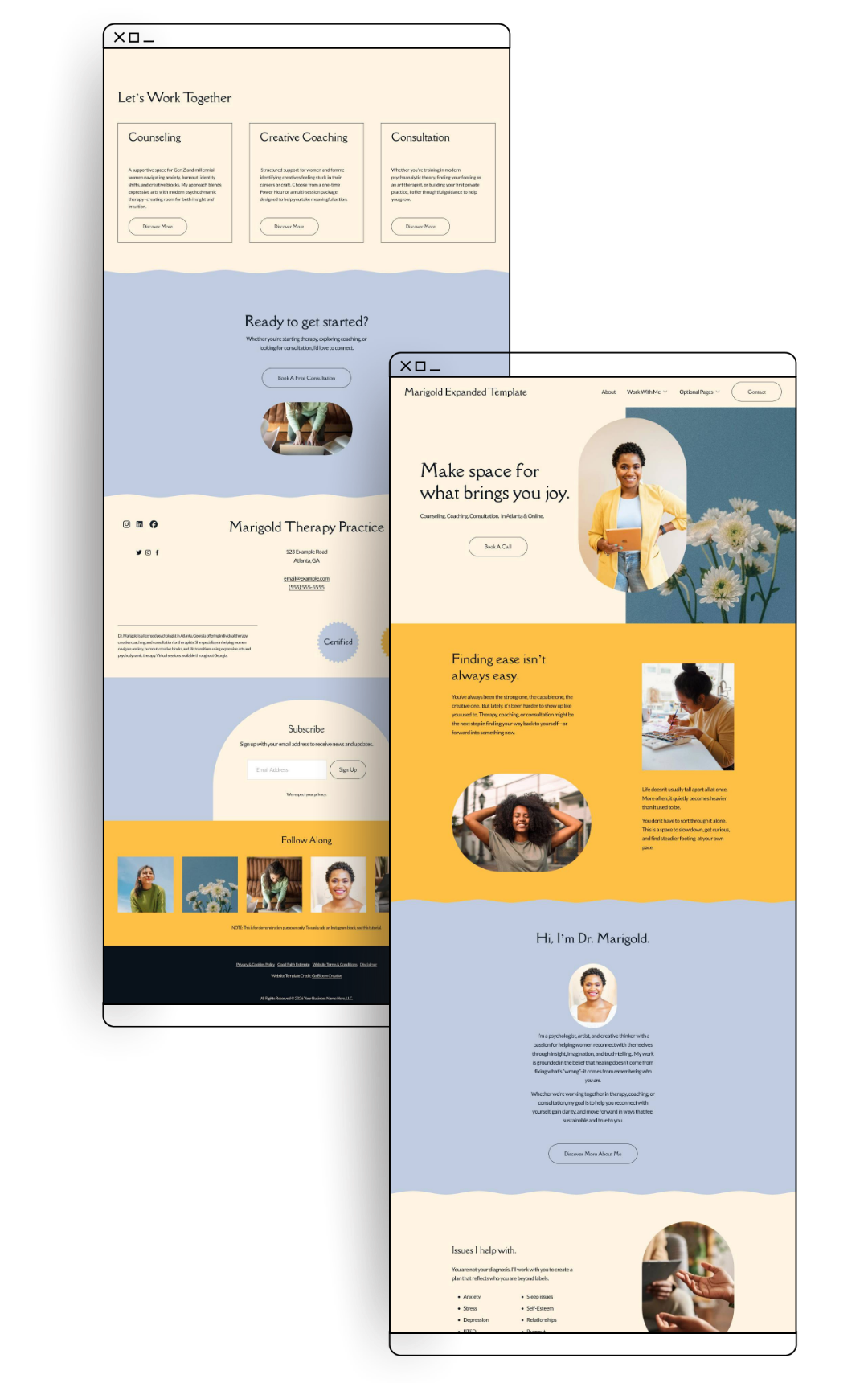
Marigold is built around possibility. Bold color, organic curves, a contemporary energy that says "you got this”. It's the template that makes a client feel like something good is about to happen.
This one might be you if:
You want your website to feel like the bright energy you actually bring to sessions
Your work is about growth, change, and forward momentum
You work with clients in transition (burnout recovery, life changes, identity work, self-discovery)
Coaching, positive psychology, or strengths-based therapy are your lane
You want warmth, yes, but also confidence and personality
My take: Marigold reads as upbeat and energizing, and that's exactly right for the right person. If your approach is more quiet and relational, Lilac or Eucalyptus might be a better fit. But if your clients leave sessions feeling like they can take on the world? Marigold is for you.
Acacia
Light, airy and open.
The one that’s serene without being a snoozefest.
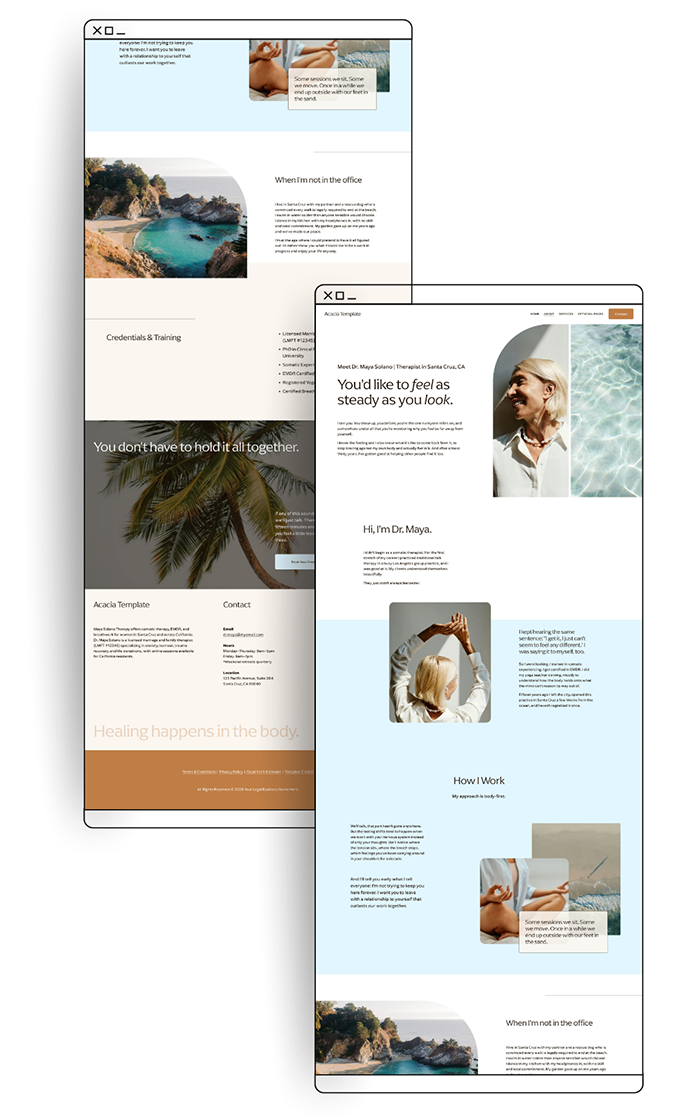
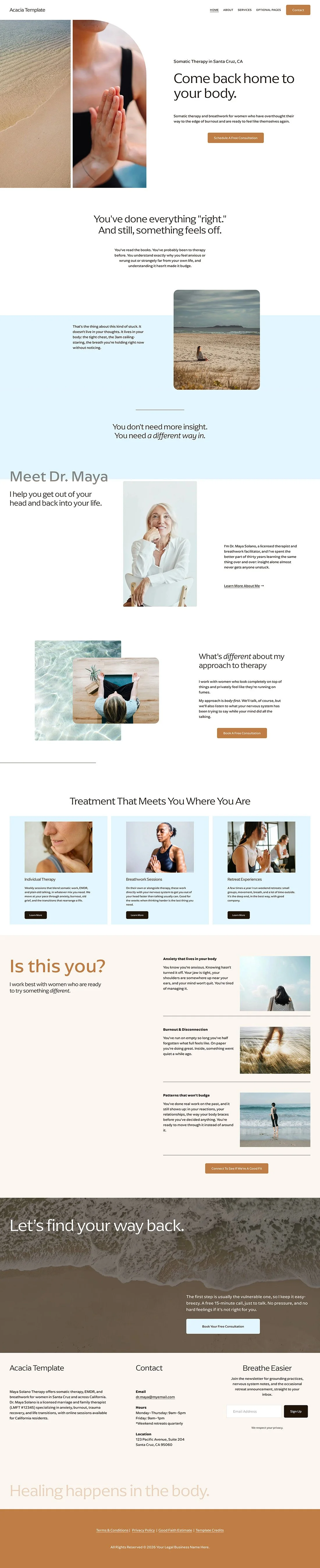
Acacia is all about light and air. It features open spacing, naturally overlapping elements, inspired by the ocean, yes, but with the warmth of sand on a summer day running through it. It feels like a room with the windows open and a breeze coming through.
A lot of soothing, beachy websites end up feeling a little flat, like they're so busy being serene that they forgot to have a pulse. Acacia stays calm without going sleepy. Settling, but also a little energizing.
It's built for therapists whose work engages the body as much as the mind. If what happens in your sessions is about more than talking, Acacia gives you an online home for that.
This one might be you if:
Your work is body-based or holistic
You work with clients who've already done plenty of talk therapy and want something that engages more than their thinking
You want your site to feel calm and human rather than corporate or clinical
You're drawn to a bright, open, coastal feeling
Optional: You bring in mindfulness, yoga, or time in nature, or you run retreats and workshops alongside sessions
Honest take: Acacia and Eucalyptus are the two calm templates in my shop, but they are also somehow kind of opposite. Eucalyptus is minimal and quiet, whereas Acacia is bright and open. If your practice has a warm, embodied, "let's get out of our heads" energy, Acacia is the one. The demo shows a somatic practice, but every page is fully yours to rename and rewrite. You're not buying “a breathwork website.” You're getting a flexible foundation to make your own.
Eucalyptus
Clean, minimal, thoughtful, elegant.
The one for when you feel like less is more.
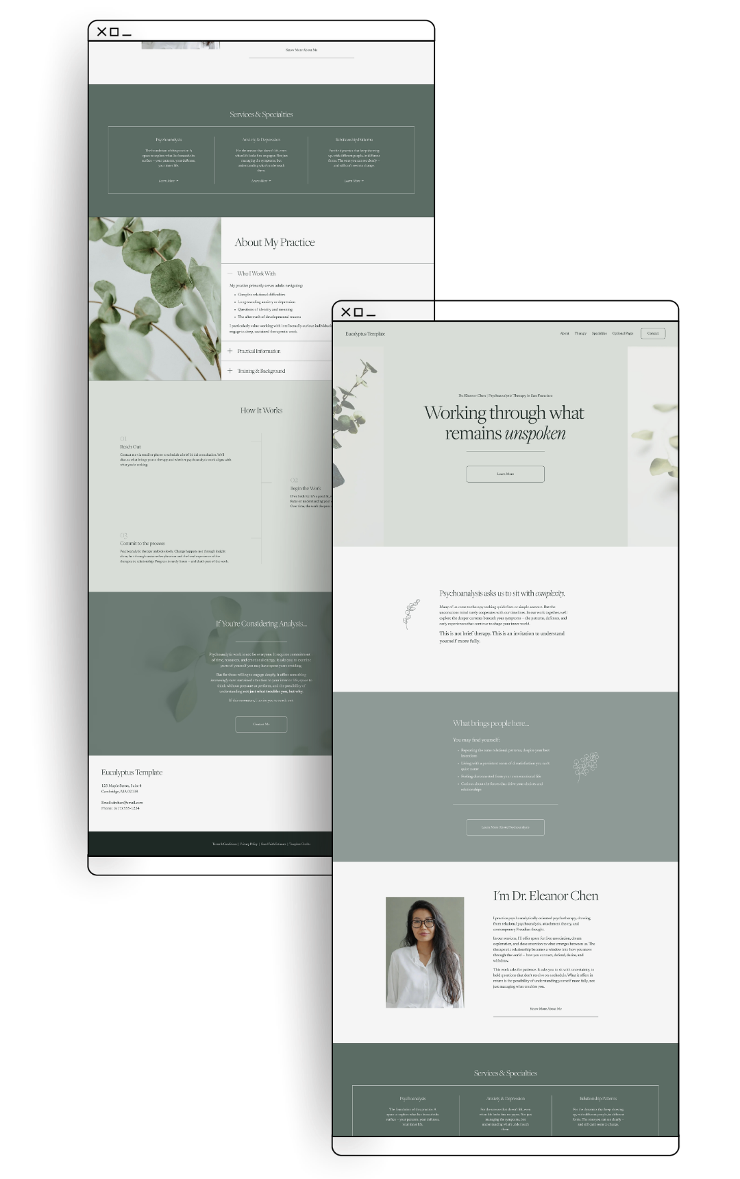
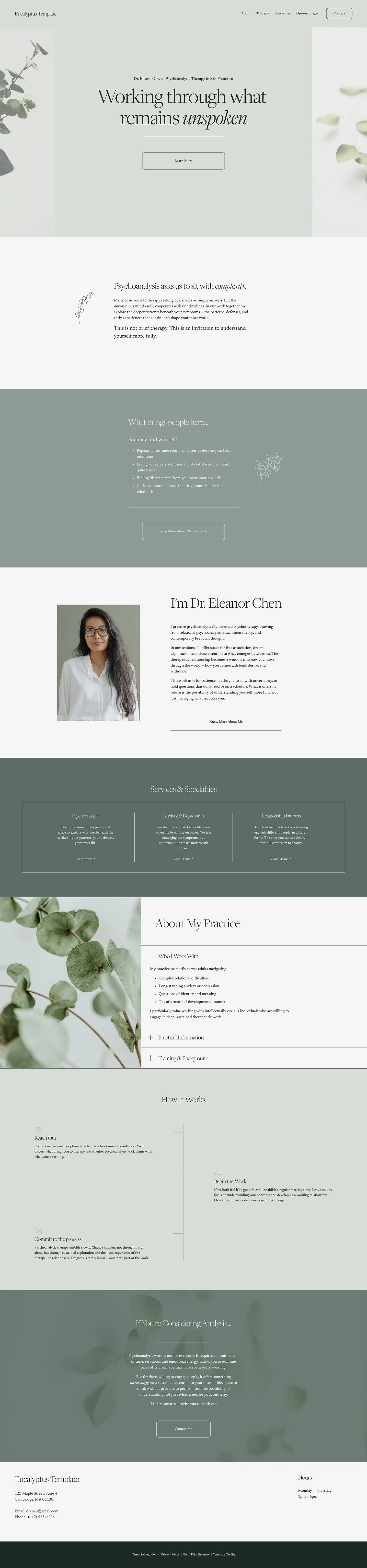
Eucalyptus is a minimalist design at its core and it wad made to solve a specific problem that many therapists have: what do you do if you don't have a big library of photos to work with?
If you have a collection of professional headshots, lifestyle photos, and polished images to fill all that visual real estate, great. But a lot of therapists (especially those just starting out) are working with one good headshot and not much else. Eucalyptus is built for that reality.
Instead of relying on photos to carry the design, Eucalyptus uses considered layouts, beautiful fonts, background texture, and delicate botanical line drawings. And BTW, those little drawings aren't static clip art. They're built into the template in a way that automatically adapts to your color theme in Squarespace. Change your colors, the illustrations change with them. No Canva, no outside editing, no extra steps. (And of course, if you don’t want them, you can simply take them out, and the design still stands on its own).
This one might be you if:
You're in the early stages of practice and don't have a full photo library yet
You want a minimal, clean aesthetic without a lot of visual noise
You love botanical, nature-inspired design
You've looked at other templates and thought "I love the vibe but I don't have enough photos to make that work (and I do'n’t relish the thought of finding stock photos)”
My take: Eucalyptus is the most minimal template in the shop. If you want drama, depth, and visual impact, one of the other four will serve you better. But if you want something clean and genuinely beautiful that doesn't ask more of you than you have to give right now? This is it.
Poppy
Bright, playful, personality-forward.
The one that announces itself.
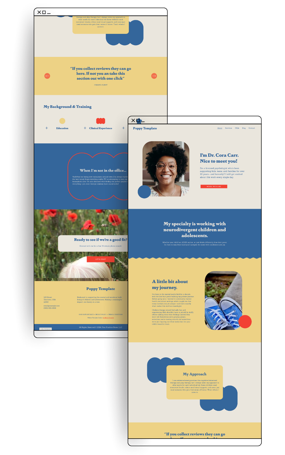
Poppy doesn't play it safe, and that's the whole idea behind this design. If you just clicked through tons of therapy websites (as many clients do) you would land on this one and immediately feel awake. I built Poppy for the therapist who would look at a generic beige therapy website and say “this is not it.”
This one might be you if:
You have a strong visual identity and you're not afraid to use it
Your practice has a niche (not just for children, think: ADHD/neurodivergence, young adults, LGBTQ+ clients, creatives) and you want people to feel "yep, this is for me" the second they land on your site
You've been holding back on your website because you felt like therapy sites were "supposed to" look soft and beige and that’s just not you
You like vibrant color and geometric shapes
My take: Poppy is the most daring template and also the most polarizing of all the templates, which is exactly why I love it. The goal isn't for everyone to love it. The goal is for the right person to land on your site and immediately think "this is a therapist who gets me."
Lilac Template
Soft, friendly, organized.
The one that feels like a welcoming front door.
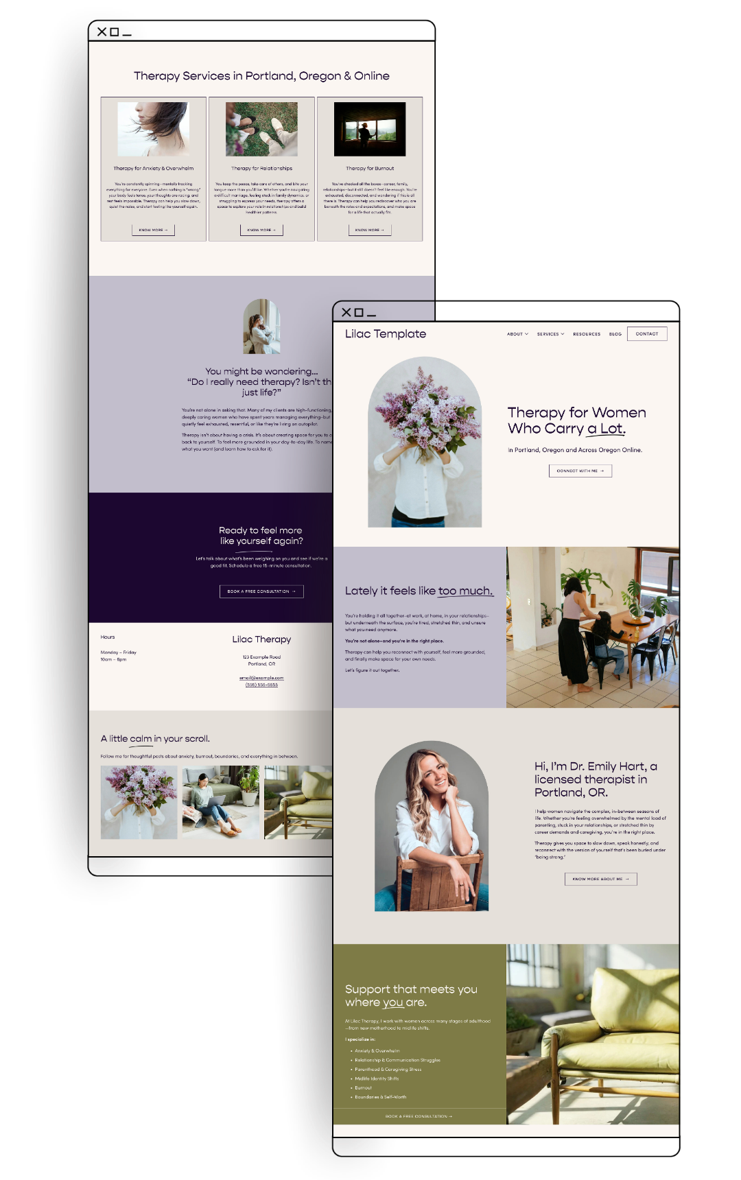
Lilac has a gentle energy. Calming without being bland, with a warmth that comes through immediately. If your ideal client is someone who may be hesitant about therapy, Lilac is a great way to go.
This one might be you if:
You want your website to feel nurturing and calming from the first second
Your practice has a gentle, relational feel and you want the design to match
You work with clients who are anxious, burned out, or approaching therapy for the first time and need to feel welcomed immediately
My take: Lilac is the most universally appealing template in the shop. If you want something with more personality or edge, one of the others might serve you better. But if "calming and professional" is the direction, Lilac is hard to beat.
Magnolia
Clean, sophisticated, professional.
The one that means business.
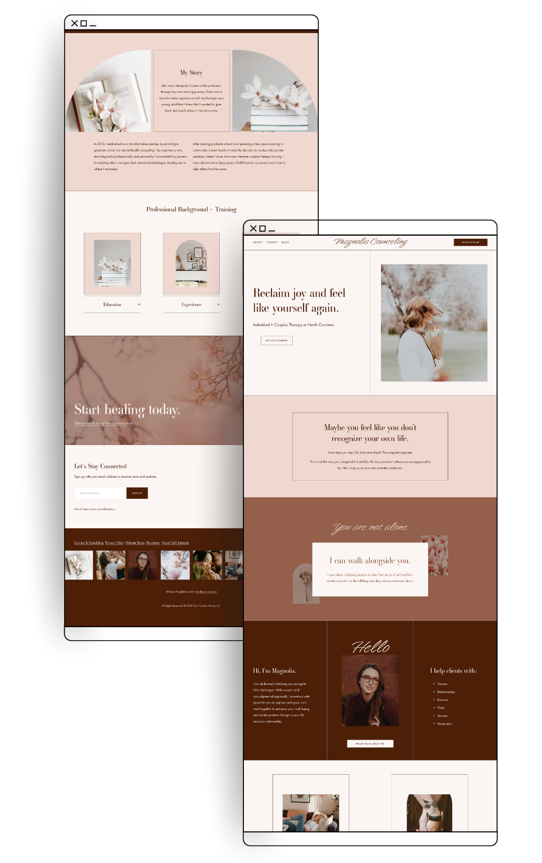
Magnolia is polished to perfection. It's clean and structured, with a quiet confidence to it. It doesn't shout, but it doesn't shrink either. If you want your website to feel like you've been doing this for a while and you know exactly what you're doing, Magnolia gives you that.
This one might be you if:
You want a site that reads as established and professional
Your work is with higher-stakes clients (executives, professionals, complex trauma, intensive formats) and you want the design to match the weight of what you do
You're a few years into practice and your current site doesn't reflect how far you've come
You want sophisticated over soft — refined color choices, considered structure, clean typography
My take: Magnolia is surprisingly versatile. The structure is clean and consistent, which means your color and font choices have a lot of room to breathe, so it can look dramatically different depending on what you bring to it. (This post shows exactly what's possible with the Magnolia template with 3 different stylings: a coaching site, a men’s mental health site, and a family therapy focused site)
So all that is to say, if your first instinct is "this site might not feel personal enough," that's probably not going to be the issue.
Still not sure?
A few tips that might help:
1) Go with your gut. The template that made you stop scrolling is probably the right one.
2)If you're genuinely torn between two: pick the one you'd be more excited to customize. You'll spend a few hours with it, and that matters.
More templates are on the way as the shop grows. Each new design is built to fill a distinct gap — so if none of these quite feel like yours yet, it might just be a matter of timing. The best way to stay in the loop is to get on the email list.
Browse Templates


Related Reads