10 Essential Tips for the Best Therapy Website

Last updated April 2026
You know your website matters. But there's a difference between simply having one and having one that actually brings in the right-fit clients.
Getting a client who lands on your site to the point where they fill out your contact form really comes down to just a handful of specific decisions.
After years of building websites exclusively for therapists in private practice, I can tell you the 10 choices to focus on that will make the biggest difference.
The 10 Private Practice Website Essentials Checklist
Keep your menu bar simple and uncluttered.
Use high-resolution images for your site (and make sure you choose the “right” ones).
Use just 1–2 fonts, and keep them consistent.
Choose a color scheme and stick with it
Have at least one up-to-date headshot
Make sure the mobile version of your site looks great.
Write for your client, not for your colleagues.
Have a clear call-to-action on every page.
Make your contact info easy to find on every page.
Proofread. Proofread. Proofread.
If this all makes sense to you then great, read no further 👍
But if you’re like “Huh?” keep reading, I’ll explain it all step-by-step.
1. Keep your menu bar simple and uncluttered
Your menu bar is the strip of links at the top of every page. It's also some of the most valuable real estate on your entire site. Here's how to use it well:
If you have more than two specialty or service pages, nest them into a dropdown instead of listing everything across the top. This makes things easier to find and keeps your menu bar streamlined.
Aim for one click to get to your contact info from anywhere on your website. If someone has to hunt, you’re likely to lose them.
You don't need a "Home" link. Fun fact: your logo or site title does that job! Use those spots for pages that really need to be there.
Stick to 5–7 items max. More than that and the nav starts to feel overwhelming.
What should you include? At minimum: Services and/or Specialties, About Me, FAQ page (if using)and Contact. Everything else is optional depending on your practice.
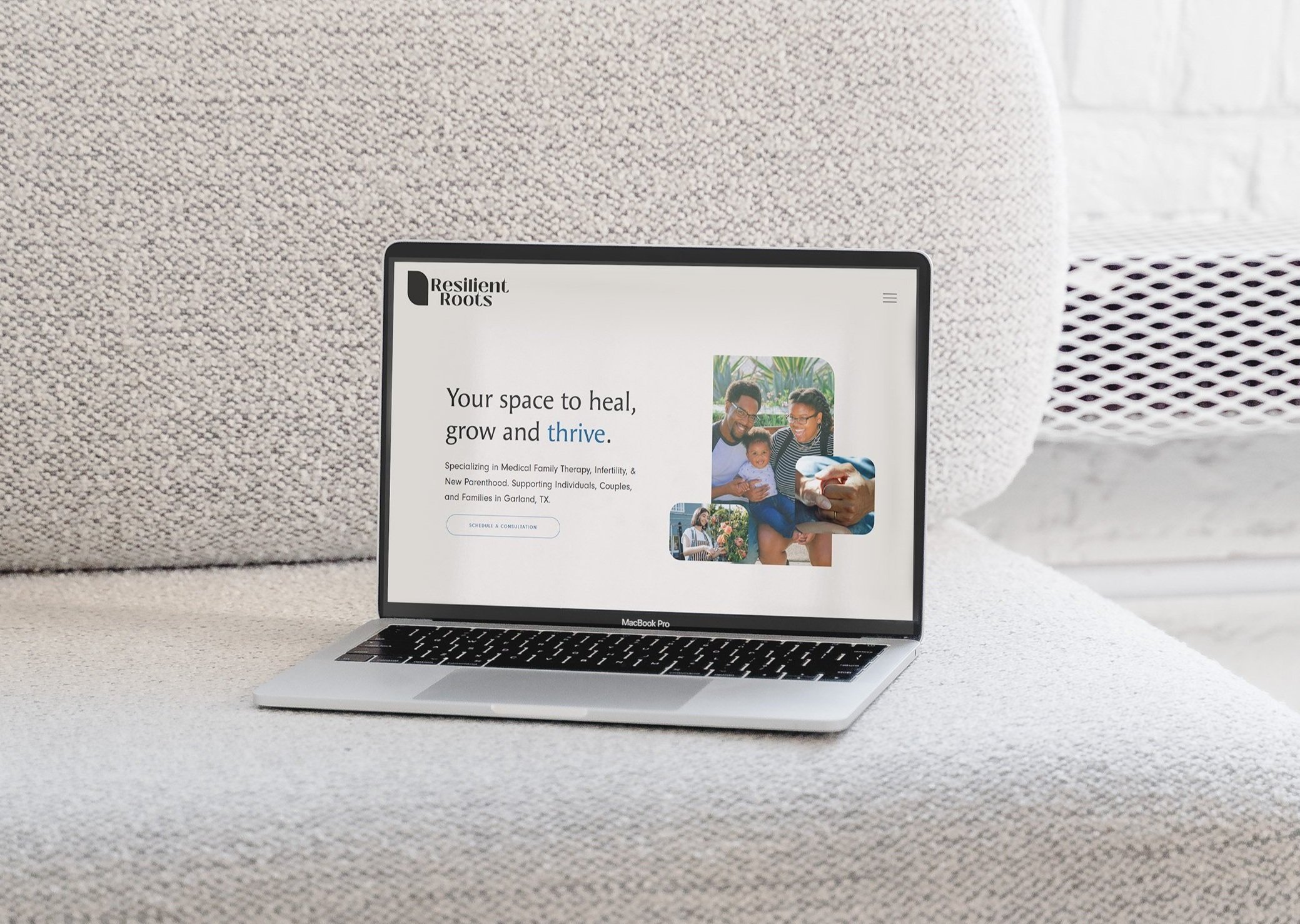
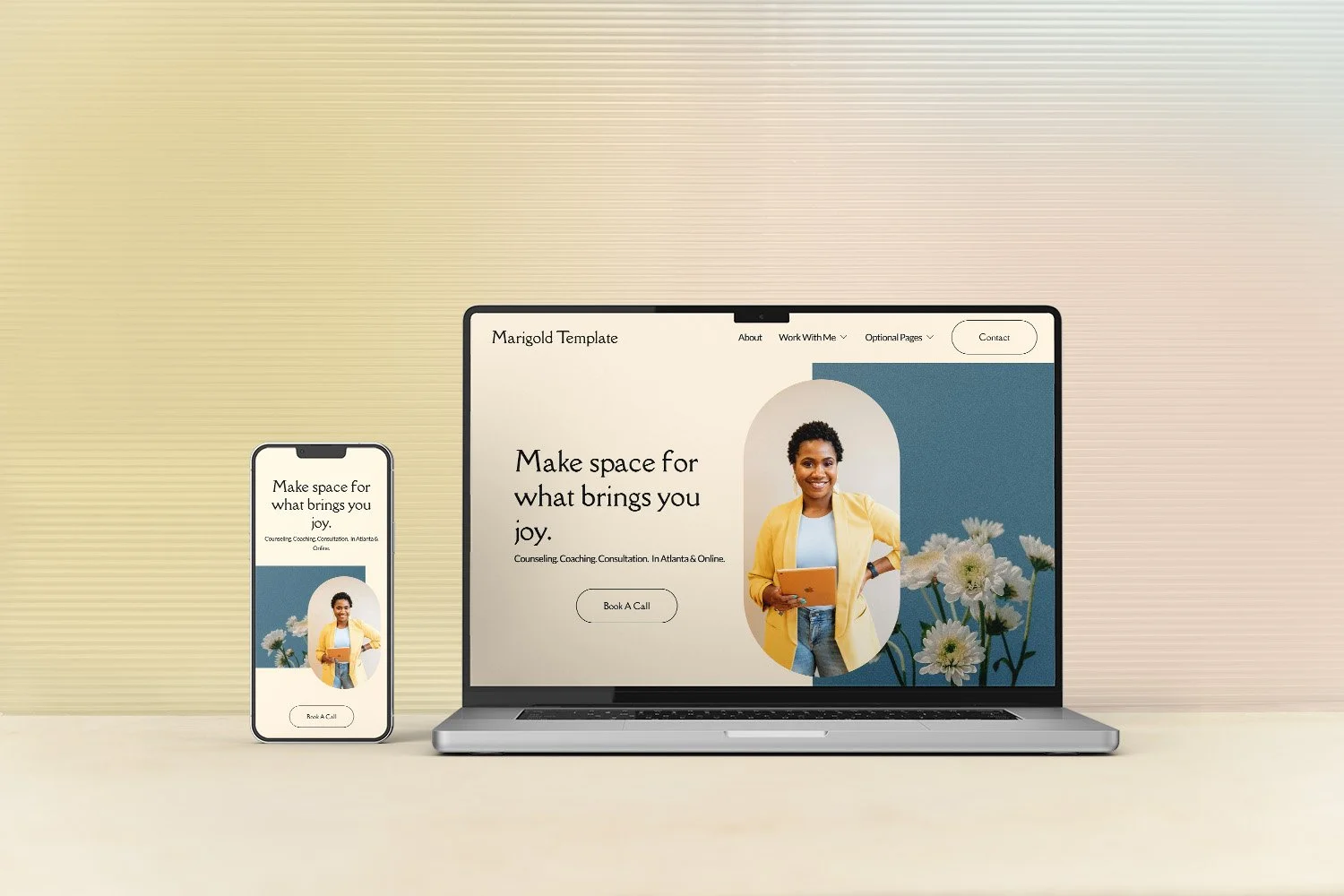
2. Choose high-resolution images (and choose the “right” ones)
Photos do a lot of heavy lifting on a therapy website to convey tone and brand message without words Here's the technical side first: images should be crisp at any screen size and between 250-500KB in file size.
Why? Larger files slow your site down, and a slow site loses people fast.
As for choosing the “right” photos, if you don’t have a set of brand photos to use, you may want to supplement with stock images:
Show the "after," not the "before." People should look how your clients feel after working with you, aka, not anxious, angry or sad. Hopeful. Lighter. Connected.
Use photos with people in them (even if it’s not faces). Humans are drawn to other humans. A hand, a face, the back of someone's head–all more compelling than a landscape.
Skip the clichés. Stacked rocks, arms outstretched toward the sky, generic nature shots–your client has seen these on every other therapy site. Choose images that actually reflect who you are and who you serve.
Keep a cohesive theme. Your photos don't have to match perfectly, but they should feel like they belong in the same story.
For a deeper dive on finding and choosing the right photos check out this post:
👉 How to Choose Stock Photos for Your Counseling Website
3. Use just 1–2 fonts, and keep them consistent
This one is simple but makes a big difference especially when you are DIYing your site.
Website builders, like Squarespace, come loaded with beautiful font options and it's tempting to use a bunch of them. Don't. Here’s why:
Each font slows your site speed (and slow site = clients leaving)
It’s easier to make it look polished and cohesive–font pairing is a tricky to get right, even for experienced designers!
One important note: decorative, cursive, or handwritten fonts should be used sparingly (if at all). A few words? Fine. A whole paragraph? Avoid it. These types of fonts can be hard to read and potentially cause an accessibility issue. At the very least, be sure never to put critical information such as your contact details, your services, your fees, in a decorative font.
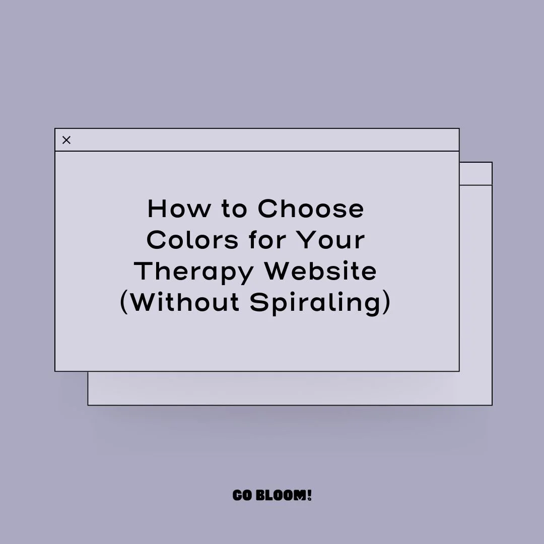
4. Choose a color scheme and stick with it
A cohesive color palette is one of the fastest ways to make a DIY website look designer-made. A few pointers:
Don't pick something just because it's trending or because it looks great on someone else's site. You're going to be looking at this for a long time.
Think about what the color conveys. Color communicates something before a single word is read. It doesn't have to be a deep dive into color theory. Just consider what feeling you want someone to have when they land on your site, and whether your palette supports that feeling.
Keep it simple. Two or three colors, used consistently, will always look more intentional than six colors used haphazardly.
Want a more guided approach to the whole color decision? Read this post:
👉 How to Choose Colors for Your Therapy Website (Without Spiraling on Pinterest)
Ready to dive in and play with color? These two free tools are a really fun way to explore:
Coolors An extremely addictive way to make palettes, consider yourself warned 😂
Adobe Color Experiment with the color wheel and variations on your fave hue.
Both of these also have color contrast checkers to make sure your palette is accessible to all visitors.
5. Have at least one up-to-date headshot
Potential clients are making a significant decision when they reach out to a therapist. Being able to see your face matters more than most therapists realize. In a way, it's the beginning of the relationship.
If you’re on the fence, I do a deeper dive in this article:
👉 Do You Need Photos of Yourself on a Therapy Website?
Your photo should be recent. How recent is recent enough? There's no hard rule, but think about big changes in your appearance, how dated it looks, or how much your practice has evolved since it was taken. When in doubt, update it.
I also often get asked about video, and I kind of have a hot take 🔥 If you're genuinely comfortable on camera, it can be a wonderful way for clients to get a feel for you before reaching out. But an uncomfortable video can do more harm than good.
Bottom line:if it's not your thing, don't stress it. Spend that energy somewhere else.
Ready to get a great headshot but not sure how to prepare? Check out this post:
👉 How to Get a Great Headshot as a Therapist
6. Make sure the mobile version of your site looks great
More than half of your visitors are coming to your site on their phones! So if your mobile experience is an afterthought, you're losing people before they've even read a word.
The good news: if you're on Squarespace (and honestly most website builders these days), customizing your mobile view is straightforward.
Check out this post for a step-by-step walkthrough:
👉 How to Customize the Mobile Version of Your Squarespace Website
Not sure if your site passes the mobile test? Here are three free tools to check:
PageSpeed Insights Plug in any URL and get a mobile performance report, no account needed
Semrush Free Website Audit Useful upfront, though FYI, they'll nudge you toward a paid plan for the full picture
Google Search Console If you're already connected, look for the Mobile Usability Report under "Experience." Google Search Console is the industry standard for understanding site search, but for a layperson it can be a little complicated and the setup can feel tricky, so go for the other two first.
7. Write for your client, not for your colleagues
In my opinion, client-centered content is the most important thing on your website.
Here's what client-centered copy does not look like:
"I earned my Master's Degree at Anytown University and graduated with honors. I am certified in ERP, EMDR, EFT, CBT, and ABCDEFG. I treat Anxiety, PTSD, Major Depressive Disorder, and Adjustment Disorders."
Credentials, acronyms, diagnoses. Nothing about the person reading it.
Let’s think about what the client might actually say when they come to therapy:
"I feel like I'm walking through mud. Everything is on top of me. I have all these things I know I need to do, but I can't do any of them. I don't even want to get out of bed some days. It all feels pointless."
Now, can you see how that first version wouldn't land for someone in that emotional state? They're not looking for your CV. They're looking for evidence that you get them.
Here's what it looks like when you write from that client-centered place instead:
"You have a list a mile long and zero energy to touch it. Getting out of bed some days feels like more than you can ask of yourself — and you're exhausted from pretending otherwise. That's exactly where we start."
Same therapist. Completely different effect.
A few writing tips to keep in mind:
Say "you" more than "I." Your website should feel like a conversation between you and a client. The purpose is to show that they are seen.
Skip the diagnosis, describe the experience. Your client isn't thinking "I have Major Depressive Disorder." They're thinking "I can't get out of bed."
Show competence through specificity. The more precisely you can describe what someone is going through, the more trust you build without listing a single credential (though you do want to still include those-just not lead with them).
Break up walls of text. Short paragraphs. Concise sentences. Your reader is likely already overwhelmed. Don’t add to it. Imagine they are reading the site at one of their most vulnerable moments.
For a deeper dive on writing content that actually connects:
👉 How to Write Therapy Website Content That Actually Connects
For more support with writing:
👉 Meet Bloomy, my AI writing assistant built just for therapist websites. All of these principles are baked in, so you're not starting from scratch.
8. Have a clear call-to-action on every page
A “call-to-action” (or CTA) is just marketing-speak for "tell people what to do next." And if you don't, many of them won't do anything not because they aren't smart, or interested, but because they had to guess. Uncertainty leads to inaction.
There are two types of CTAs worth thinking about:
(Required) Primary CTAs guide someone toward contacting you. These should be on every page, and more than once is totally OK:
"Schedule a free 15-minute consultation"
"Get in touch to get started"
"Ready to take the next step? Let's talk"
(Optional) Secondary CTAs are for people who aren't quite ready yet they want to stay connected without committing:
"Read more about my approach"
"Download my free resource"
"Follow me on Instagram"
The goal is simple: no one should reach the bottom of a page and think "now what?" Every page needs a clear next step.
🌻 Speaking of next steps, if you're building or refreshing your therapy website, here are a few resources from me:
Browse therapist website templates designed specifically for therapists in private practice
Grab the Free Website Toolkit everything you need to prep before you build your site
Meet Bloomy my AI writing assistant that I built myself, exclusively for therapist websites
9. Make your contact info easy to find on every page
This one sounds obvious. And yet, I see therapy websites all the time where the location and contact information is buried, incomplete, or missing altogether.
Your potential clients are already doing something hard by looking for a therapist. Let’s make it super easy for them.
A few things to check:
Your contact page should be clearly labeled in your main navigation. Skip the "Get Started" or "Let’s Chat." Just "Contact." Clear beats clever every time.
Don't forget your location. Where you're licensed to practice should be easy to find, not buried in your footer.
Include a contact button or link in both your header and footer so it's visible no matter where someone is on the site.
Make sure phone numbers are clickable on mobile. If someone has to manually dial a number they read off a screen, some of them won't bother.
The easier you make it to reach you, the more people will!
10. Proofread. Proofread. Proofread.
Your website is a way to show your clients who you are, and how you work.
Of course, it’s human to make mistakes, and it’s good for clients to see that! I’m not talking about a few little typos here and there (that’s not the ned of the world). I’m talking about things like I’ve seen, like “psychotherapy” spelled wrong in a navigation. These types of errors can look careless and unprofessional (even though you absolutely are neither of those things!).
If you know spelling is not your strong suit, that is totally OK.
But that just means you do need to get support. Have a trusted colleague or friend help. Of use the ample tech available out there. Your website needs to look like you put care and thought into it, so if there are a lot of errors, it can look like you just dashed it off, and that doesn’t leave a good impression.
Ready to put this into action?
These 10 things will make sure your website is actually doing its job (instead of getting in the way). Your website doesn't need to be perfect. It just needs to be clear, consistent, and reflective of who you are as a therapist so that when the right person lands on it they thinks "yes, this is the one."
Feel overwhelmed? Start with whatever feels right, make one change at a time, and remember: your website is a living document. It grows as your practice grows.
🌻 Here's where to go next:
Browse therapy website templates designed specifically for therapists in private practice
Grab the free Website Toolkit everything you need to prep your website parts before you build
Meet Bloomy my AI writing assistant exclusively built (by me!) for therapist websites